Sayed Jamal Mirkamali
Understanding Bayesian A/B testing (using baseball statistics)
Well, Mike Piazza has a slightly higher career batting average (2127 hits / 6911 at-bats = 0.308) than Hank Aaron (3771 hits / 12364 at-bats = 0.305). But can we say with confidence that his skill is actually higher, or is it possible he just got lucky a bit more often?
In this series of posts about an empirical Bayesian approach to batting statistics, we’ve been estimating batting averages by modeling them as a binomial distribution with a beta prior. But we’ve been looking at a single batter at a time. What if we want to compare two batters, give a probability that one is better than the other, and estimate by how much?
This is a topic rather relevant to my own work and to the data science field, because understanding the difference between two proportions is important in A/B testing. One of the most common examples of A/B testing is comparing clickthrough rates (“out of X impressions, there have been Y clicks”)- which on the surface is similar to our batting average estimation problem (“out of X at-bats, there have been Y hits””).1
Here, we’re going to look at an empirical Bayesian approach to comparing two batters.2 We’ll define the problem in terms of the difference between each batter’s posterior distribution, and look at four mathematical and computational strategies we can use to resolve this question. While we’re focusing on baseball here, remember that similar strategies apply to A/B testing, and indeed to many Bayesian models.
Python - Kernel tricks and nonlinear dimensionality reduction via RBF kernel PCA
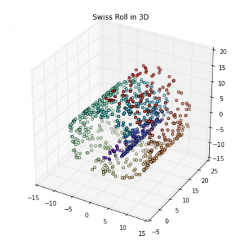
Most machine learning algorithms have been developed and statistically validated for linearly separable data. Popular examples are linear classifiers like Support Vector Machines (SVMs) or the (standard) Principal Component Analysis (PCA) for dimensionality reduction. However, most real world data requires nonlinear methods in order to perform tasks that involve the analysis and discovery of patterns successfully.
The focus of this article is to briefly introduce the idea of kernel methods and to implement a Gaussian radius basis function (RBF) kernel that is used to perform nonlinear dimensionality reduction via BF kernel principal component analysis (kPCA).
Machine Learning is dead - Long live machine learning!

You may be thinking that this title makes no sense at all. ML, AI, ANN and Deep learning have made it into the everyday lexicon and here I am, proclaiming that ML is dead. Well, here is what I mean…
The open sourcing of entire ML frameworks marks the end of a phase of rapid development of tools, and thus marks the death of ML as we have known it so far. The next phase will be marked with ubiquitous application of these tools into software applications. And that is how ML will live forever, because it will seamlessly and inextricably integrate into our lives.
Rootograms, A new way to assess count models
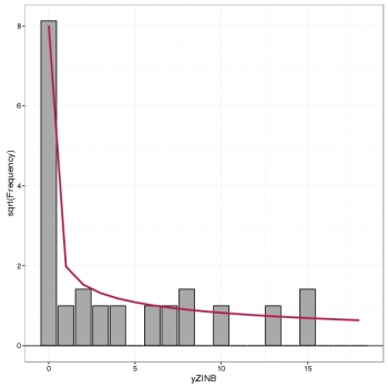
Assessing the fit of a count regression model is not necessarily a straightforward enterprise; often we just look at residuals, which invariably contain patterns of some form due to the discrete nature of the observations, or we plot observed versus fitted values as a scatter plot. Recently, while perusing the latest statistics offerings on ArXiv I came across Kleiber and Zeileis (2016) who propose the rootogram as an improved approach to the assessment of fit of a count regression model. The paper is illustrated using R and the authors’ countreg package (currently on R-Forge only). Here, I thought I’d take a quick look at the rootogram with some simulated species abundance data.
Review A Course in Statistics with R by Tattar P.N. et. al
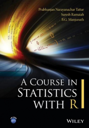
Integrates the theory and applications of statistics using R. A Course in Statistics with R has been written to bridge the gap between theory and applications and explain how mathematical expressions are converted into R programs. The book has been primarily designed as a useful companion for a Masters student during each semester of the course, but will also help applied statisticians in revisiting the underpinnings of the subject. With this dual goal in mind, the book begins with R basics and quickly covers visualization and exploratory analysis. Probability and statistical inference, inclusive of classical, nonparametric, and Bayesian schools, is developed with definitions, motivations, mathematical expression and R programs in a way which will help the reader to understand the mathematical development as well as R implementation. Linear regression models, experimental designs, multivariate analysis, and categorical data analysis are treated in a way which makes effective use of visualization techniques and the related statistical techniques underlying them through practical applications, and hence helps the reader to achieve a clear understanding of the associated statistical models.
SAS bets on cloud and machine learning with new Viya analytics architecture

On Tuesday, analytics company SAS announced Viya, its new analytics and visualization architecture. A SAS spokeswoman said Viya would become the "foundation for all future SAS products."
The goal of Viya is to make analytics more accessible to all users and to better support cloud-native apps and data stored in the cloud.
The announcement came at the 2016 SAS Global Forum, the company's annual conference for SAS users and executives, which took place in Las Vegas. Viya will be available as part of an early adopter program in May, but it will reach general availability sometime in Q3 of 2016.
About Us
SDAT is an abbreviation for Scientific Data Analysis Team. It consists of groups who are specialists in various fields of data sciences including Statistical Analytics, Business Analytics, Big Data Analytics and Health Analytics.
Get In Touch
Address: No.15 13th West Street, North Sarrafan, Apt. No. 1 Saadat Abad- Tehran
Phone: +98-910-199-2800
Email: info@sdat.ir
Login Form
Joomla! Debug Console
{
    "__default": {
        "session": {
            "counter": 2,
            "timer": {
                "start": 1755554455,
                "last": 1755554455,
                "now": 1755554457
            },
            "token": "M4F9X6rbtdc8rIaNQbxNoBryw4lQSYvG"
        },
        "registry": {
            "mailto": {
                "mailto": {
                    "form": {
                        "data": {
                            "link": "8393de3e1734cf1f1bc3a8521316b500c6f4e5e4",
                            "sender": "",
                            "subject": "",
                            "emailfrom": "",
                            "emailto": ""
                        }
                    }
                }
            }
        },
        "user": {
            "id": 0,
            "name": null,
            "username": null,
            "email": null,
            "password": null,
            "password_clear": "",
            "block": null,
            "sendEmail": 0,
            "registerDate": null,
            "lastvisitDate": null,
            "activation": null,
            "params": null,
            "groups": [],
            "guest": 1,
            "lastResetTime": null,
            "resetCount": null,
            "requireReset": null,
            "aid": 0
        },
        "plg_system_languagefilter": {
            "language": "en-GB"
        }
    }
}
Time
Memory
46 Queries Logged 34.40 ms
- Query Time: 0.51 ms Query memory: 0.005 MB Memory before query: 4.292 MB Rows returned: 1
SELECT `session_id`

  FROM `w0v41_session`

  WHERE `session_id` = X'3835303036393364353266643063623065323230373063303436643037656135'
LIMIT 1id select_type table partitions type possible_keys key key_len ref rows filtered Extra 1 SIMPLE w0v41_session NULL const PRIMARY PRIMARY 194 const 1 100.00 Using index Status Duration starting 0.15 ms Executing hook on transaction 0.01 ms starting 0.01 ms checking permissions 0.01 ms Opening tables 0.03 ms init 0.01 ms System lock 0.01 ms optimizing 0.01 ms statistics 0.06 ms preparing 0.01 ms executing 0.01 ms end 0.01 ms query end 0.01 ms waiting for handler commit 0.01 ms closing tables 0.01 ms freeing items 0.05 ms cleaning up 0.03 ms # Caller File and line number 9 JDatabaseDriverMysqli->execute() JROOT/libraries/joomla/database/driver.php:1740 8 JDatabaseDriver->loadResult() JROOT/libraries/src/Session/MetadataManager.php:74 7 Joomla\CMS\Session\MetadataManager->createRecordIfNonExisting() JROOT/libraries/src/Application/CMSApplication.php:154 6 Joomla\CMS\Application\CMSApplication->checkSession() JROOT/libraries/src/Application/CMSApplication.php:828 5 Joomla\CMS\Application\CMSApplication->loadSession() JROOT/libraries/src/Application/CMSApplication.php:136 4 Joomla\CMS\Application\CMSApplication->__construct() JROOT/libraries/src/Application/SiteApplication.php:66 3 Joomla\CMS\Application\SiteApplication->__construct() JROOT/libraries/src/Application/CMSApplication.php:386 2 Joomla\CMS\Application\CMSApplication::getInstance() JROOT/libraries/src/Factory.php:140 1 Joomla\CMS\Factory::getApplication() JROOT/index.php:46 - Query Time: 0.37 ms After last query: 10.12 ms Query memory: 0.005 MB Memory before query: 4.880 MB Rows returned: 7
SELECT id, rules

FROM `w0v41_viewlevels`id select_type table partitions type possible_keys key key_len ref rows filtered Extra 1 SIMPLE w0v41_viewlevels NULL ALL NULL NO INDEX KEY COULD BE USED NULL NULL 7 100.00 NULL Status Duration starting 0.09 ms Executing hook on transaction 0.01 ms starting 0.01 ms checking permissions 0.01 ms Opening tables 0.02 ms init 0.01 ms System lock 0.01 ms optimizing 0.01 ms statistics 0.01 ms preparing 0.01 ms executing 0.04 ms end 0.01 ms query end 0.01 ms waiting for handler commit 0.01 ms closing tables 0.01 ms freeing items 0.06 ms cleaning up 0.01 ms # Caller File and line number 10 JDatabaseDriverMysqli->execute() JROOT/libraries/joomla/database/driver.php:1506 9 JDatabaseDriver->loadAssocList() JROOT/libraries/src/Access/Access.php:1063 8 Joomla\CMS\Access\Access::getAuthorisedViewLevels() JROOT/libraries/src/User/User.php:458 7 Joomla\CMS\User\User->getAuthorisedViewLevels() JROOT/libraries/src/Plugin/PluginHelper.php:318 6 Joomla\CMS\Plugin\PluginHelper::load() JROOT/libraries/src/Plugin/PluginHelper.php:87 5 Joomla\CMS\Plugin\PluginHelper::getPlugin() JROOT/libraries/src/Plugin/PluginHelper.php:129 4 Joomla\CMS\Plugin\PluginHelper::isEnabled() JROOT/libraries/src/Application/SiteApplication.php:604 3 Joomla\CMS\Application\SiteApplication->initialiseApp() JROOT/libraries/src/Application/SiteApplication.php:212 2 Joomla\CMS\Application\SiteApplication->doExecute() JROOT/libraries/src/Application/CMSApplication.php:225 1 Joomla\CMS\Application\CMSApplication->execute() JROOT/index.php:49 - Query Time: 0.48 ms After last query: 0.08 ms Query memory: 0.005 MB Memory before query: 4.893 MB Rows returned: 2
SELECT b.id

  FROM w0v41_usergroups AS a

  LEFT JOIN w0v41_usergroups AS b
  ON b.lft <= a.lft
  AND b.rgt >= a.rgt

WHERE a.id = 9id select_type table partitions type possible_keys key key_len ref rows filtered Extra 1 SIMPLE a NULL const PRIMARY PRIMARY 4 const 1 100.00 NULL 1 SIMPLE b NULL range idx_usergroup_nested_set_lookup idx_usergroup_nested_set_lookup 4 NULL 2 100.00 Using where; Using index Status Duration starting 0.11 ms Executing hook on transaction 0.01 ms starting 0.01 ms checking permissions 0.01 ms checking permissions 0.01 ms Opening tables 0.03 ms init 0.01 ms System lock 0.01 ms optimizing 0.01 ms statistics 0.11 ms preparing 0.03 ms executing 0.02 ms end 0.01 ms query end 0.01 ms waiting for handler commit 0.01 ms closing tables 0.01 ms freeing items 0.05 ms cleaning up 0.02 ms # Caller File and line number 11 JDatabaseDriverMysqli->execute() JROOT/libraries/joomla/database/driver.php:1550 10 JDatabaseDriver->loadColumn() JROOT/libraries/src/Access/Access.php:980 9 Joomla\CMS\Access\Access::getGroupsByUser() JROOT/libraries/src/Access/Access.php:1095 8 Joomla\CMS\Access\Access::getAuthorisedViewLevels() JROOT/libraries/src/User/User.php:458 7 Joomla\CMS\User\User->getAuthorisedViewLevels() JROOT/libraries/src/Plugin/PluginHelper.php:318 6 Joomla\CMS\Plugin\PluginHelper::load() JROOT/libraries/src/Plugin/PluginHelper.php:87 5 Joomla\CMS\Plugin\PluginHelper::getPlugin() JROOT/libraries/src/Plugin/PluginHelper.php:129 4 Joomla\CMS\Plugin\PluginHelper::isEnabled() JROOT/libraries/src/Application/SiteApplication.php:604 3 Joomla\CMS\Application\SiteApplication->initialiseApp() JROOT/libraries/src/Application/SiteApplication.php:212 2 Joomla\CMS\Application\SiteApplication->doExecute() JROOT/libraries/src/Application/CMSApplication.php:225 1 Joomla\CMS\Application\CMSApplication->execute() JROOT/index.php:49 - Query Time: 0.77 ms After last query: 37.72 ms Query memory: 0.005 MB Memory before query: 7.592 MB Rows returned: 1
SELECT `name`

  FROM `w0v41_extensions`

  WHERE `type` = 'package'
AND `element` = 'pkg_eventgallery_full'id select_type table partitions type possible_keys key key_len ref rows filtered Extra 1 SIMPLE w0v41_extensions NULL ref element_clientid,element_folder_clientid,extension element_clientid 402 const 1 10.00 Using where Status Duration starting 0.19 ms Executing hook on transaction 0.01 ms starting 0.01 ms checking permissions 0.01 ms Opening tables 0.04 ms init 0.01 ms System lock 0.01 ms optimizing 0.01 ms statistics 0.14 ms preparing 0.03 ms executing 0.05 ms end 0.01 ms query end 0.01 ms waiting for handler commit 0.01 ms closing tables 0.01 ms freeing items 0.07 ms cleaning up 0.03 ms # Caller File and line number 10 JDatabaseDriverMysqli->execute() JROOT/libraries/joomla/database/driver.php:1740 9 JDatabaseDriver->loadResult() JROOT/administrator/components/com_eventgallery/version.php:24 8 include_once JROOT/administrator/components/com_eventgallery/version.php JROOT/plugins/system/picasaupdater/picasaupdater.php:32 7 plgSystemPicasaupdater->__construct() JROOT/libraries/src/Plugin/PluginHelper.php:280 6 Joomla\CMS\Plugin\PluginHelper::import() JROOT/libraries/src/Plugin/PluginHelper.php:182 5 Joomla\CMS\Plugin\PluginHelper::importPlugin() JROOT/libraries/src/Application/CMSApplication.php:667 4 Joomla\CMS\Application\CMSApplication->initialiseApp() JROOT/libraries/src/Application/SiteApplication.php:686 3 Joomla\CMS\Application\SiteApplication->initialiseApp() JROOT/libraries/src/Application/SiteApplication.php:212 2 Joomla\CMS\Application\SiteApplication->doExecute() JROOT/libraries/src/Application/CMSApplication.php:225 1 Joomla\CMS\Application\CMSApplication->execute() JROOT/index.php:49 - Query Time: 0.55 ms After last query: 15.14 ms Query memory: 0.007 MB Memory before query: 8.283 MB Rows returned: 1Duplicate queries: #6
SELECT template

  FROM w0v41_template_styles as s

  WHERE s.client_id = 0
AND s.home = 1id select_type table partitions type possible_keys key key_len ref rows filtered Extra 1 SIMPLE s NULL ref idx_client_id,idx_client_id_home idx_client_id 1 const 6 12.50 Using where Status Duration starting 0.13 ms Executing hook on transaction 0.01 ms starting 0.01 ms checking permissions 0.01 ms Opening tables 0.04 ms init 0.01 ms System lock 0.01 ms optimizing 0.02 ms statistics 0.07 ms preparing 0.02 ms executing 0.07 ms end 0.01 ms query end 0.01 ms waiting for handler commit 0.01 ms closing tables 0.01 ms freeing items 0.05 ms cleaning up 0.02 ms # Caller File and line number 14 JDatabaseDriverMysqli->execute() JROOT/libraries/joomla/database/driver.php:1740 13 JDatabaseDriver->loadResult() JROOT/libraries/rokcommon/RokCommon/PlatformInfo/Joomla.php:31 12 RokCommon_PlatformInfo_Joomla->getDefaultTemplate() JROOT/libraries/rokcommon/RokCommon/PlatformInfo/Joomla.php:105 11 RokCommon_PlatformInfo_Joomla->setPlatformParameters() JROOT/libraries/rokcommon/RokCommon/Service.php:71 10 RokCommon_Service::getContainer() JROOT/libraries/rokcommon/include.php:38 9 require_once JROOT/libraries/rokcommon/include.php JROOT/plugins/system/rokcommon/rokcommon.php:95 8 plgSystemRokCommon->loadCommonLib() JROOT/plugins/system/rokcommon/rokcommon.php:53 7 plgSystemRokCommon->__construct() JROOT/libraries/src/Plugin/PluginHelper.php:280 6 Joomla\CMS\Plugin\PluginHelper::import() JROOT/libraries/src/Plugin/PluginHelper.php:182 5 Joomla\CMS\Plugin\PluginHelper::importPlugin() JROOT/libraries/src/Application/CMSApplication.php:667 4 Joomla\CMS\Application\CMSApplication->initialiseApp() JROOT/libraries/src/Application/SiteApplication.php:686 3 Joomla\CMS\Application\SiteApplication->initialiseApp() JROOT/libraries/src/Application/SiteApplication.php:212 2 Joomla\CMS\Application\SiteApplication->doExecute() JROOT/libraries/src/Application/CMSApplication.php:225 1 Joomla\CMS\Application\CMSApplication->execute() JROOT/index.php:49 - Query Time: 0.36 ms After last query: 0.06 ms Query memory: 0.007 MB Memory before query: 8.290 MB Rows returned: 1Duplicate queries: #5
SELECT template

  FROM w0v41_template_styles as s

  WHERE s.client_id = 0
AND s.home = 1id select_type table partitions type possible_keys key key_len ref rows filtered Extra 1 SIMPLE s NULL ref idx_client_id,idx_client_id_home idx_client_id 1 const 6 12.50 Using where Status Duration starting 0.07 ms Executing hook on transaction 0.01 ms starting 0.01 ms checking permissions 0.01 ms Opening tables 0.02 ms init 0.01 ms System lock 0.01 ms optimizing 0.02 ms statistics 0.03 ms preparing 0.01 ms executing 0.03 ms end 0.01 ms query end 0.00 ms waiting for handler commit 0.01 ms closing tables 0.01 ms freeing items 0.06 ms cleaning up 0.02 ms # Caller File and line number 15 JDatabaseDriverMysqli->execute() JROOT/libraries/joomla/database/driver.php:1740 14 JDatabaseDriver->loadResult() JROOT/libraries/rokcommon/RokCommon/PlatformInfo/Joomla.php:31 13 RokCommon_PlatformInfo_Joomla->getDefaultTemplate() JROOT/libraries/rokcommon/RokCommon/PlatformInfo/Joomla.php:67 12 RokCommon_PlatformInfo_Joomla->getDefaultTemplatePath() JROOT/libraries/rokcommon/RokCommon/PlatformInfo/Joomla.php:106 11 RokCommon_PlatformInfo_Joomla->setPlatformParameters() JROOT/libraries/rokcommon/RokCommon/Service.php:71 10 RokCommon_Service::getContainer() JROOT/libraries/rokcommon/include.php:38 9 require_once JROOT/libraries/rokcommon/include.php JROOT/plugins/system/rokcommon/rokcommon.php:95 8 plgSystemRokCommon->loadCommonLib() JROOT/plugins/system/rokcommon/rokcommon.php:53 7 plgSystemRokCommon->__construct() JROOT/libraries/src/Plugin/PluginHelper.php:280 6 Joomla\CMS\Plugin\PluginHelper::import() JROOT/libraries/src/Plugin/PluginHelper.php:182 5 Joomla\CMS\Plugin\PluginHelper::importPlugin() JROOT/libraries/src/Application/CMSApplication.php:667 4 Joomla\CMS\Application\CMSApplication->initialiseApp() JROOT/libraries/src/Application/SiteApplication.php:686 3 Joomla\CMS\Application\SiteApplication->initialiseApp() JROOT/libraries/src/Application/SiteApplication.php:212 2 Joomla\CMS\Application\SiteApplication->doExecute() JROOT/libraries/src/Application/CMSApplication.php:225 1 Joomla\CMS\Application\CMSApplication->execute() JROOT/index.php:49 - Query Time: 0.28 ms After last query: 5.36 ms Query memory: 0.005 MB Memory before query: 8.536 MB Rows returned: 2
SELECT extension, file, type

  FROM w0v41_rokcommon_configs

ORDER BY priorityid select_type table partitions type possible_keys key key_len ref rows filtered Extra 1 SIMPLE w0v41_rokcommon_configs NULL ALL NULL NO INDEX KEY COULD BE USED NULL NULL 2 100.00 Using filesort Status Duration starting 0.08 ms Executing hook on transaction 0.01 ms starting 0.01 ms checking permissions 0.01 ms Opening tables 0.02 ms init 0.01 ms System lock 0.01 ms optimizing 0.01 ms statistics 0.01 ms preparing 0.01 ms executing 0.03 ms end 0.00 ms query end 0.01 ms closing tables 0.01 ms freeing items 0.04 ms cleaning up 0.01 ms # Caller File and line number 10 JDatabaseDriverMysqli->execute() JROOT/libraries/joomla/database/driver.php:1701 9 JDatabaseDriver->loadObjectList() JROOT/plugins/system/rokcommon/rokcommon.php:131 8 plgSystemRokCommon->processRegisteredConfigs() JROOT/plugins/system/rokcommon/rokcommon.php:75 7 plgSystemRokCommon->__construct() JROOT/libraries/src/Plugin/PluginHelper.php:280 6 Joomla\CMS\Plugin\PluginHelper::import() JROOT/libraries/src/Plugin/PluginHelper.php:182 5 Joomla\CMS\Plugin\PluginHelper::importPlugin() JROOT/libraries/src/Application/CMSApplication.php:667 4 Joomla\CMS\Application\CMSApplication->initialiseApp() JROOT/libraries/src/Application/SiteApplication.php:686 3 Joomla\CMS\Application\SiteApplication->initialiseApp() JROOT/libraries/src/Application/SiteApplication.php:212 2 Joomla\CMS\Application\SiteApplication->doExecute() JROOT/libraries/src/Application/CMSApplication.php:225 1 Joomla\CMS\Application\CMSApplication->execute() JROOT/index.php:49 - Query Time: 0.75 ms After last query: 43.32 ms Query memory: 0.006 MB Memory before query: 12.414 MB Rows returned: 69
SELECT *

FROM w0v41_rsform_configid select_type table partitions type possible_keys key key_len ref rows filtered Extra 1 SIMPLE w0v41_rsform_config NULL ALL NULL NO INDEX KEY COULD BE USED NULL NULL 69 100.00 NULL Status Duration starting 0.21 ms Executing hook on transaction 0.01 ms starting 0.01 ms checking permissions 0.01 ms Opening tables 0.04 ms init 0.01 ms System lock 0.01 ms optimizing 0.01 ms statistics 0.02 ms preparing 0.02 ms executing 0.20 ms end 0.01 ms query end 0.01 ms closing tables 0.01 ms freeing items 0.05 ms cleaning up 0.02 ms # Caller File and line number 13 JDatabaseDriverMysqli->execute() JROOT/libraries/joomla/database/driver.php:1701 12 JDatabaseDriver->loadObjectList() JROOT/administrator/components/com_rsform/helpers/config.php:50 11 RSFormProConfig->load() JROOT/administrator/components/com_rsform/helpers/config.php:17 10 RSFormProConfig->__construct() JROOT/administrator/components/com_rsform/helpers/config.php:102 9 RSFormProConfig::getInstance() JROOT/plugins/system/rsformdeletesubmissions/rsformdeletesubmissions.php:28 8 plgSystemRsformdeletesubmissions->onAfterInitialise() JROOT/libraries/joomla/event/event.php:70 7 JEvent->update() JROOT/libraries/joomla/event/dispatcher.php:160 6 JEventDispatcher->trigger() JROOT/libraries/src/Application/BaseApplication.php:108 5 Joomla\CMS\Application\BaseApplication->triggerEvent() JROOT/libraries/src/Application/CMSApplication.php:668 4 Joomla\CMS\Application\CMSApplication->initialiseApp() JROOT/libraries/src/Application/SiteApplication.php:686 3 Joomla\CMS\Application\SiteApplication->initialiseApp() JROOT/libraries/src/Application/SiteApplication.php:212 2 Joomla\CMS\Application\SiteApplication->doExecute() JROOT/libraries/src/Application/CMSApplication.php:225 1 Joomla\CMS\Application\CMSApplication->execute() JROOT/index.php:49 - Query Time: 1.75 ms After last query: 2.55 ms Query memory: 0.007 MB Memory before query: 12.596 MB Rows returned: 20
SHOW FULL COLUMNS
FROM `w0v41_extensions`EXPLAIN not possible on query: SHOW FULL COLUMNS FROM `w0v41_extensions`Status Duration starting 0.12 ms Executing hook on transaction 0.01 ms starting 0.07 ms checking permissions 0.01 ms checking permissions 0.00 ms Opening tables 0.61 ms init 0.01 ms System lock 0.01 ms optimizing 0.02 ms statistics 0.10 ms preparing 0.02 ms Creating tmp table 0.05 ms executing 0.09 ms checking permissions 0.07 ms checking permissions 0.03 ms checking permissions 0.02 ms checking permissions 0.02 ms checking permissions 0.02 ms checking permissions 0.02 ms checking permissions 0.01 ms checking permissions 0.01 ms checking permissions 0.02 ms checking permissions 0.02 ms checking permissions 0.02 ms checking permissions 0.02 ms checking permissions 0.02 ms checking permissions 0.01 ms checking permissions 0.02 ms checking permissions 0.01 ms checking permissions 0.02 ms checking permissions 0.03 ms checking permissions 0.02 ms checking permissions 0.03 ms checking permissions 0.02 ms checking permissions 0.05 ms end 0.01 ms query end 0.01 ms waiting for handler commit 0.02 ms closing tables 0.02 ms freeing items 0.07 ms cleaning up 0.03 ms # Caller File and line number 15 JDatabaseDriverMysqli->execute() JROOT/libraries/joomla/database/driver.php:1701 14 JDatabaseDriver->loadObjectList() JROOT/libraries/joomla/database/driver/mysqli.php:448 13 JDatabaseDriverMysqli->getTableColumns() JROOT/libraries/src/Table/Table.php:261 12 Joomla\CMS\Table\Table->getFields() JROOT/libraries/src/Table/Table.php:180 11 Joomla\CMS\Table\Table->__construct() JROOT/libraries/src/Table/Extension.php:32 10 Joomla\CMS\Table\Extension->__construct() JROOT/libraries/src/Table/Table.php:328 9 Joomla\CMS\Table\Table::getInstance() JROOT/plugins/system/roksprocket/roksprocket.php:45 8 plgSystemRokSprocket->onAfterInitialise() JROOT/libraries/joomla/event/event.php:70 7 JEvent->update() JROOT/libraries/joomla/event/dispatcher.php:160 6 JEventDispatcher->trigger() JROOT/libraries/src/Application/BaseApplication.php:108 5 Joomla\CMS\Application\BaseApplication->triggerEvent() JROOT/libraries/src/Application/CMSApplication.php:668 4 Joomla\CMS\Application\CMSApplication->initialiseApp() JROOT/libraries/src/Application/SiteApplication.php:686 3 Joomla\CMS\Application\SiteApplication->initialiseApp() JROOT/libraries/src/Application/SiteApplication.php:212 2 Joomla\CMS\Application\SiteApplication->doExecute() JROOT/libraries/src/Application/CMSApplication.php:225 1 Joomla\CMS\Application\CMSApplication->execute() JROOT/index.php:49 - Query Time: 0.33 ms After last query: 1.23 ms Query memory: 0.005 MB Memory before query: 12.712 MB Rows returned: 1
SELECT `extension_id`

  FROM `w0v41_extensions`

  WHERE type = 'component'
AND element = 'com_roksprocket'id select_type table partitions type possible_keys key key_len ref rows filtered Extra 1 SIMPLE w0v41_extensions NULL ref element_clientid,element_folder_clientid,extension extension 484 const,const 1 100.00 Using index Status Duration starting 0.07 ms Executing hook on transaction 0.01 ms starting 0.01 ms checking permissions 0.01 ms Opening tables 0.02 ms init 0.01 ms System lock 0.01 ms optimizing 0.01 ms statistics 0.07 ms preparing 0.01 ms executing 0.02 ms end 0.01 ms query end 0.01 ms waiting for handler commit 0.01 ms closing tables 0.01 ms freeing items 0.04 ms cleaning up 0.01 ms # Caller File and line number 11 JDatabaseDriverMysqli->execute() JROOT/libraries/joomla/database/driver.php:1740 10 JDatabaseDriver->loadResult() JROOT/libraries/src/Table/Extension.php:124 9 Joomla\CMS\Table\Extension->find() JROOT/plugins/system/roksprocket/roksprocket.php:47 8 plgSystemRokSprocket->onAfterInitialise() JROOT/libraries/joomla/event/event.php:70 7 JEvent->update() JROOT/libraries/joomla/event/dispatcher.php:160 6 JEventDispatcher->trigger() JROOT/libraries/src/Application/BaseApplication.php:108 5 Joomla\CMS\Application\BaseApplication->triggerEvent() JROOT/libraries/src/Application/CMSApplication.php:668 4 Joomla\CMS\Application\CMSApplication->initialiseApp() JROOT/libraries/src/Application/SiteApplication.php:686 3 Joomla\CMS\Application\SiteApplication->initialiseApp() JROOT/libraries/src/Application/SiteApplication.php:212 2 Joomla\CMS\Application\SiteApplication->doExecute() JROOT/libraries/src/Application/CMSApplication.php:225 1 Joomla\CMS\Application\CMSApplication->execute() JROOT/index.php:49 - Query Time: 0.29 ms After last query: 0.07 ms Query memory: 0.005 MB Memory before query: 12.719 MB Rows returned: 1Duplicate queries: #13
SELECT *

  FROM w0v41_extensions

WHERE `extension_id` = '10274'id select_type table partitions type possible_keys key key_len ref rows filtered Extra 1 SIMPLE w0v41_extensions NULL const PRIMARY PRIMARY 4 const 1 100.00 NULL Status Duration starting 0.06 ms Executing hook on transaction 0.01 ms starting 0.01 ms checking permissions 0.01 ms Opening tables 0.02 ms init 0.01 ms System lock 0.01 ms optimizing 0.02 ms statistics 0.04 ms preparing 0.01 ms executing 0.02 ms end 0.01 ms query end 0.00 ms waiting for handler commit 0.01 ms closing tables 0.01 ms freeing items 0.04 ms cleaning up 0.01 ms # Caller File and line number 11 JDatabaseDriverMysqli->execute() JROOT/libraries/joomla/database/driver.php:1465 10 JDatabaseDriver->loadAssoc() JROOT/libraries/src/Table/Table.php:747 9 Joomla\CMS\Table\Table->load() JROOT/plugins/system/roksprocket/roksprocket.php:54 8 plgSystemRokSprocket->onAfterInitialise() JROOT/libraries/joomla/event/event.php:70 7 JEvent->update() JROOT/libraries/joomla/event/dispatcher.php:160 6 JEventDispatcher->trigger() JROOT/libraries/src/Application/BaseApplication.php:108 5 Joomla\CMS\Application\BaseApplication->triggerEvent() JROOT/libraries/src/Application/CMSApplication.php:668 4 Joomla\CMS\Application\CMSApplication->initialiseApp() JROOT/libraries/src/Application/SiteApplication.php:686 3 Joomla\CMS\Application\SiteApplication->initialiseApp() JROOT/libraries/src/Application/SiteApplication.php:212 2 Joomla\CMS\Application\SiteApplication->doExecute() JROOT/libraries/src/Application/CMSApplication.php:225 1 Joomla\CMS\Application\CMSApplication->execute() JROOT/index.php:49 - Query Time: 0.28 ms After last query: 0.06 ms Query memory: 0.005 MB Memory before query: 12.723 MB Rows returned: 1
SELECT `extension_id`

  FROM `w0v41_extensions`

  WHERE type = 'module'
AND element = 'mod_roksprocket'id select_type table partitions type possible_keys key key_len ref rows filtered Extra 1 SIMPLE w0v41_extensions NULL ref element_clientid,element_folder_clientid,extension extension 484 const,const 1 100.00 Using index Status Duration starting 0.06 ms Executing hook on transaction 0.01 ms starting 0.01 ms checking permissions 0.01 ms Opening tables 0.01 ms init 0.01 ms System lock 0.01 ms optimizing 0.01 ms statistics 0.05 ms preparing 0.01 ms executing 0.02 ms end 0.01 ms query end 0.01 ms waiting for handler commit 0.01 ms closing tables 0.01 ms freeing items 0.04 ms cleaning up 0.01 ms # Caller File and line number 11 JDatabaseDriverMysqli->execute() JROOT/libraries/joomla/database/driver.php:1740 10 JDatabaseDriver->loadResult() JROOT/libraries/src/Table/Extension.php:124 9 Joomla\CMS\Table\Extension->find() JROOT/plugins/system/roksprocket/roksprocket.php:70 8 plgSystemRokSprocket->onAfterInitialise() JROOT/libraries/joomla/event/event.php:70 7 JEvent->update() JROOT/libraries/joomla/event/dispatcher.php:160 6 JEventDispatcher->trigger() JROOT/libraries/src/Application/BaseApplication.php:108 5 Joomla\CMS\Application\BaseApplication->triggerEvent() JROOT/libraries/src/Application/CMSApplication.php:668 4 Joomla\CMS\Application\CMSApplication->initialiseApp() JROOT/libraries/src/Application/SiteApplication.php:686 3 Joomla\CMS\Application\SiteApplication->initialiseApp() JROOT/libraries/src/Application/SiteApplication.php:212 2 Joomla\CMS\Application\SiteApplication->doExecute() JROOT/libraries/src/Application/CMSApplication.php:225 1 Joomla\CMS\Application\CMSApplication->execute() JROOT/index.php:49 - Query Time: 0.25 ms After last query: 0.05 ms Query memory: 0.005 MB Memory before query: 12.729 MB Rows returned: 1Duplicate queries: #11
SELECT *

  FROM w0v41_extensions

WHERE `extension_id` = '10274'id select_type table partitions type possible_keys key key_len ref rows filtered Extra 1 SIMPLE w0v41_extensions NULL const PRIMARY PRIMARY 4 const 1 100.00 NULL Status Duration starting 0.05 ms Executing hook on transaction 0.01 ms starting 0.01 ms checking permissions 0.01 ms Opening tables 0.02 ms init 0.01 ms System lock 0.01 ms optimizing 0.01 ms statistics 0.02 ms preparing 0.01 ms executing 0.02 ms end 0.01 ms query end 0.01 ms waiting for handler commit 0.01 ms closing tables 0.01 ms freeing items 0.04 ms cleaning up 0.01 ms # Caller File and line number 11 JDatabaseDriverMysqli->execute() JROOT/libraries/joomla/database/driver.php:1465 10 JDatabaseDriver->loadAssoc() JROOT/libraries/src/Table/Table.php:747 9 Joomla\CMS\Table\Table->load() JROOT/plugins/system/roksprocket/roksprocket.php:76 8 plgSystemRokSprocket->onAfterInitialise() JROOT/libraries/joomla/event/event.php:70 7 JEvent->update() JROOT/libraries/joomla/event/dispatcher.php:160 6 JEventDispatcher->trigger() JROOT/libraries/src/Application/BaseApplication.php:108 5 Joomla\CMS\Application\BaseApplication->triggerEvent() JROOT/libraries/src/Application/CMSApplication.php:668 4 Joomla\CMS\Application\CMSApplication->initialiseApp() JROOT/libraries/src/Application/SiteApplication.php:686 3 Joomla\CMS\Application\SiteApplication->initialiseApp() JROOT/libraries/src/Application/SiteApplication.php:212 2 Joomla\CMS\Application\SiteApplication->doExecute() JROOT/libraries/src/Application/CMSApplication.php:225 1 Joomla\CMS\Application\CMSApplication->execute() JROOT/index.php:49 - Query Time: 1.20 ms After last query: 175.30 ms Query memory: 0.006 MB Memory before query: 16.935 MB
UPDATE `w0v41_extensions`

  SET `params` = '{\"mediaversion\":\"b8eb189de3941098d0fd17a82f8ec6db\"}'

  WHERE `type` = 'library'
AND `element` = 'joomla'EXPLAIN not possible on query: UPDATE `w0v41_extensions` SET `params` = '{\"mediaversion\":\"b8eb189de3941098d0fd17a82f8ec6db\"}' WHERE `type` = 'library' AND `element` = 'joomla'Status Duration starting 0.23 ms Executing hook on transaction 0.01 ms starting 0.01 ms checking permissions 0.01 ms Opening tables 0.06 ms init 0.01 ms System lock 0.13 ms updating 0.10 ms end 0.01 ms query end 0.01 ms waiting for handler commit 0.39 ms closing tables 0.03 ms freeing items 0.08 ms cleaning up 0.02 ms # Caller File and line number 14 JDatabaseDriverMysqli->execute() JROOT/libraries/src/Helper/LibraryHelper.php:117 13 Joomla\CMS\Helper\LibraryHelper::saveParams() JROOT/libraries/src/Version.php:372 12 Joomla\CMS\Version->setMediaVersion() JROOT/libraries/src/Version.php:331 11 Joomla\CMS\Version->getMediaVersion() JROOT/libraries/src/Factory.php:778 10 Joomla\CMS\Factory::createDocument() JROOT/libraries/src/Factory.php:234 9 Joomla\CMS\Factory::getDocument() JROOT/plugins/system/k2/k2.php:374 8 plgSystemK2->onAfterRoute() JROOT/libraries/joomla/event/event.php:70 7 JEvent->update() JROOT/libraries/joomla/event/dispatcher.php:160 6 JEventDispatcher->trigger() JROOT/libraries/src/Application/BaseApplication.php:108 5 Joomla\CMS\Application\BaseApplication->triggerEvent() JROOT/libraries/src/Application/CMSApplication.php:1190 4 Joomla\CMS\Application\CMSApplication->route() JROOT/libraries/src/Application/SiteApplication.php:796 3 Joomla\CMS\Application\SiteApplication->route() JROOT/libraries/src/Application/SiteApplication.php:218 2 Joomla\CMS\Application\SiteApplication->doExecute() JROOT/libraries/src/Application/CMSApplication.php:225 1 Joomla\CMS\Application\CMSApplication->execute() JROOT/index.php:49 - Query Time: 1.75 ms After last query: 18.08 ms Query memory: 0.006 MB Memory before query: 17.711 MB Rows returned: 60
SELECT `id`,`name`,`rules`,`parent_id`

  FROM `w0v41_assets`

WHERE `name` IN ('root.1','com_actionlogs','com_acym','com_acymailing','com_admin','com_adminmenumanager','com_advportfoliopro','com_ajax','com_akeeba','com_associations','com_banners','com_bdthemes_shortcodes','com_cache','com_categories','com_checkin','com_cjlib','com_config','com_contact','com_content','com_contenthistory','com_cpanel','com_eventgallery','com_extplorer','com_fields','com_finder','com_installer','com_jce','com_jmap','com_joominapayments','com_joomlaupdate','com_k2','com_languages','com_login','com_mailto','com_media','com_menus','com_messages','com_modules','com_newsfeeds','com_plugins','com_postinstall','com_privacy','com_profiles','com_redirect','com_roksprocket','com_rsform','com_search','com_sigpro','com_smartcountdown3','com_speventum','com_splms','com_spmedical','com_sppagebuilder','com_spsimpleportfolio','com_tags','com_teamchart','com_templates','com_tinypayment','com_uniterevolution2','com_users','com_wrapper')id select_type table partitions type possible_keys key key_len ref rows filtered Extra 1 SIMPLE w0v41_assets NULL range idx_asset_name idx_asset_name 202 NULL 61 100.00 Using index condition Status Duration starting 0.30 ms Executing hook on transaction 0.01 ms starting 0.01 ms checking permissions 0.01 ms Opening tables 0.29 ms init 0.02 ms System lock 0.01 ms optimizing 0.02 ms statistics 0.23 ms preparing 0.03 ms executing 0.56 ms end 0.01 ms query end 0.01 ms waiting for handler commit 0.01 ms closing tables 0.01 ms freeing items 0.07 ms cleaning up 0.03 ms # Caller File and line number 13 JDatabaseDriverMysqli->execute() JROOT/libraries/joomla/database/driver.php:1701 12 JDatabaseDriver->loadObjectList() JROOT/libraries/src/Access/Access.php:429 11 Joomla\CMS\Access\Access::preloadComponents() JROOT/libraries/src/Access/Access.php:213 10 Joomla\CMS\Access\Access::preload() JROOT/libraries/src/Access/Access.php:531 9 Joomla\CMS\Access\Access::getAssetRules() JROOT/libraries/src/Access/Access.php:183 8 Joomla\CMS\Access\Access::check() JROOT/libraries/src/User/User.php:398 7 Joomla\CMS\User\User->authorise() JROOT/components/com_k2/k2.php:15 6 require_once JROOT/components/com_k2/k2.php JROOT/libraries/src/Component/ComponentHelper.php:402 5 Joomla\CMS\Component\ComponentHelper::executeComponent() JROOT/libraries/src/Component/ComponentHelper.php:377 4 Joomla\CMS\Component\ComponentHelper::renderComponent() JROOT/libraries/src/Application/SiteApplication.php:194 3 Joomla\CMS\Application\SiteApplication->dispatch() JROOT/libraries/src/Application/SiteApplication.php:233 2 Joomla\CMS\Application\SiteApplication->doExecute() JROOT/libraries/src/Application/CMSApplication.php:225 1 Joomla\CMS\Application\CMSApplication->execute() JROOT/index.php:49 - Query Time: 0.63 ms After last query: 27.02 ms Query memory: 0.009 MB Memory before query: 19.186 MB Rows returned: 1
SELECT enabled
  FROM w0v41_extensions
  WHERE element = 'com_sppagebuilder'
AND type = 'component'id select_type table partitions type possible_keys key key_len ref rows filtered Extra 1 SIMPLE w0v41_extensions NULL ref element_clientid,element_folder_clientid,extension element_clientid 402 const 1 10.00 Using where Status Duration starting 0.17 ms Executing hook on transaction 0.01 ms starting 0.01 ms checking permissions 0.01 ms Opening tables 0.04 ms init 0.01 ms System lock 0.01 ms optimizing 0.01 ms statistics 0.12 ms preparing 0.02 ms executing 0.04 ms end 0.01 ms query end 0.01 ms waiting for handler commit 0.01 ms closing tables 0.01 ms freeing items 0.05 ms cleaning up 0.03 ms # Caller File and line number 18 JDatabaseDriverMysqli->execute() JROOT/libraries/joomla/database/driver.php:1740 17 JDatabaseDriver->loadResult() JROOT/plugins/content/sppagebuilder/sppagebuilder.php:172 16 PlgContentSppagebuilder->isSppagebuilderEnabled() JROOT/plugins/content/sppagebuilder/sppagebuilder.php:36 15 PlgContentSppagebuilder->__construct() JROOT/libraries/src/Plugin/PluginHelper.php:280 14 Joomla\CMS\Plugin\PluginHelper::import() JROOT/libraries/src/Plugin/PluginHelper.php:182 13 Joomla\CMS\Plugin\PluginHelper::importPlugin() JROOT/components/com_k2/views/itemlist/view.html.php:65 12 K2ViewItemlist->display() JROOT/libraries/src/Cache/Controller/ViewController.php:102 11 Joomla\CMS\Cache\Controller\ViewController->get() JROOT/libraries/src/MVC/Controller/BaseController.php:655 10 Joomla\CMS\MVC\Controller\BaseController->display() JROOT/components/com_k2/controllers/controller.php:20 9 K2Controller->display() JROOT/components/com_k2/controllers/itemlist.php:50 8 K2ControllerItemlist->display() JROOT/libraries/src/MVC/Controller/BaseController.php:702 7 Joomla\CMS\MVC\Controller\BaseController->execute() JROOT/components/com_k2/k2.php:57 6 require_once JROOT/components/com_k2/k2.php JROOT/libraries/src/Component/ComponentHelper.php:402 5 Joomla\CMS\Component\ComponentHelper::executeComponent() JROOT/libraries/src/Component/ComponentHelper.php:377 4 Joomla\CMS\Component\ComponentHelper::renderComponent() JROOT/libraries/src/Application/SiteApplication.php:194 3 Joomla\CMS\Application\SiteApplication->dispatch() JROOT/libraries/src/Application/SiteApplication.php:233 2 Joomla\CMS\Application\SiteApplication->doExecute() JROOT/libraries/src/Application/CMSApplication.php:225 1 Joomla\CMS\Application\CMSApplication->execute() JROOT/index.php:49 - Query Time: 1.68 ms After last query: 6.36 ms Query memory: 0.011 MB Memory before query: 19.531 MB Rows returned: 17
SHOW FULL COLUMNS
FROM `w0v41_users`EXPLAIN not possible on query: SHOW FULL COLUMNS FROM `w0v41_users`Status Duration starting 0.13 ms Executing hook on transaction 0.01 ms starting 0.04 ms checking permissions 0.01 ms checking permissions 0.00 ms Opening tables 0.60 ms init 0.01 ms System lock 0.01 ms optimizing 0.02 ms statistics 0.10 ms preparing 0.03 ms Creating tmp table 0.05 ms executing 0.09 ms checking permissions 0.07 ms checking permissions 0.02 ms checking permissions 0.02 ms checking permissions 0.01 ms checking permissions 0.01 ms checking permissions 0.02 ms checking permissions 0.02 ms checking permissions 0.02 ms checking permissions 0.02 ms checking permissions 0.02 ms checking permissions 0.02 ms checking permissions 0.02 ms checking permissions 0.02 ms checking permissions 0.02 ms checking permissions 0.02 ms checking permissions 0.02 ms checking permissions 0.02 ms checking permissions 0.02 ms checking permissions 0.05 ms end 0.01 ms query end 0.01 ms waiting for handler commit 0.02 ms closing tables 0.02 ms freeing items 0.06 ms cleaning up 0.01 ms # Caller File and line number 24 JDatabaseDriverMysqli->execute() JROOT/libraries/joomla/database/driver.php:1701 23 JDatabaseDriver->loadObjectList() JROOT/libraries/joomla/database/driver/mysqli.php:448 22 JDatabaseDriverMysqli->getTableColumns() JROOT/libraries/src/Table/Table.php:261 21 Joomla\CMS\Table\Table->getFields() JROOT/libraries/src/Table/Table.php:180 20 Joomla\CMS\Table\Table->__construct() JROOT/libraries/src/Table/User.php:41 19 Joomla\CMS\Table\User->__construct() JROOT/libraries/src/Table/Table.php:328 18 Joomla\CMS\Table\Table::getInstance() JROOT/libraries/src/User/User.php:603 17 Joomla\CMS\User\User::getTable() JROOT/libraries/src/User/User.php:877 16 Joomla\CMS\User\User->load() JROOT/libraries/src/User/User.php:248 15 Joomla\CMS\User\User->__construct() JROOT/libraries/src/User/User.php:301 14 Joomla\CMS\User\User::getInstance() JROOT/libraries/src/Factory.php:266 13 Joomla\CMS\Factory::getUser() JROOT/components/com_k2/views/itemlist/view.html.php:347 12 K2ViewItemlist->display() JROOT/libraries/src/Cache/Controller/ViewController.php:102 11 Joomla\CMS\Cache\Controller\ViewController->get() JROOT/libraries/src/MVC/Controller/BaseController.php:655 10 Joomla\CMS\MVC\Controller\BaseController->display() JROOT/components/com_k2/controllers/controller.php:20 9 K2Controller->display() JROOT/components/com_k2/controllers/itemlist.php:50 8 K2ControllerItemlist->display() JROOT/libraries/src/MVC/Controller/BaseController.php:702 7 Joomla\CMS\MVC\Controller\BaseController->execute() JROOT/components/com_k2/k2.php:57 6 require_once JROOT/components/com_k2/k2.php JROOT/libraries/src/Component/ComponentHelper.php:402 5 Joomla\CMS\Component\ComponentHelper::executeComponent() JROOT/libraries/src/Component/ComponentHelper.php:377 4 Joomla\CMS\Component\ComponentHelper::renderComponent() JROOT/libraries/src/Application/SiteApplication.php:194 3 Joomla\CMS\Application\SiteApplication->dispatch() JROOT/libraries/src/Application/SiteApplication.php:233 2 Joomla\CMS\Application\SiteApplication->doExecute() JROOT/libraries/src/Application/CMSApplication.php:225 1 Joomla\CMS\Application\CMSApplication->execute() JROOT/index.php:49 - Query Time: 0.42 ms After last query: 0.11 ms Query memory: 0.009 MB Memory before query: 19.569 MB Rows returned: 1
SELECT *

  FROM `w0v41_users`

WHERE `id` = 111id select_type table partitions type possible_keys key key_len ref rows filtered Extra 1 SIMPLE w0v41_users NULL const PRIMARY PRIMARY 4 const 1 100.00 NULL Status Duration starting 0.07 ms Executing hook on transaction 0.01 ms starting 0.01 ms checking permissions 0.01 ms Opening tables 0.12 ms init 0.01 ms System lock 0.01 ms optimizing 0.01 ms statistics 0.03 ms preparing 0.01 ms executing 0.02 ms end 0.00 ms query end 0.00 ms waiting for handler commit 0.01 ms closing tables 0.01 ms freeing items 0.05 ms cleaning up 0.01 ms # Caller File and line number 19 JDatabaseDriverMysqli->execute() JROOT/libraries/joomla/database/driver.php:1465 18 JDatabaseDriver->loadAssoc() JROOT/libraries/src/Table/User.php:87 17 Joomla\CMS\Table\User->load() JROOT/libraries/src/User/User.php:880 16 Joomla\CMS\User\User->load() JROOT/libraries/src/User/User.php:248 15 Joomla\CMS\User\User->__construct() JROOT/libraries/src/User/User.php:301 14 Joomla\CMS\User\User::getInstance() JROOT/libraries/src/Factory.php:266 13 Joomla\CMS\Factory::getUser() JROOT/components/com_k2/views/itemlist/view.html.php:347 12 K2ViewItemlist->display() JROOT/libraries/src/Cache/Controller/ViewController.php:102 11 Joomla\CMS\Cache\Controller\ViewController->get() JROOT/libraries/src/MVC/Controller/BaseController.php:655 10 Joomla\CMS\MVC\Controller\BaseController->display() JROOT/components/com_k2/controllers/controller.php:20 9 K2Controller->display() JROOT/components/com_k2/controllers/itemlist.php:50 8 K2ControllerItemlist->display() JROOT/libraries/src/MVC/Controller/BaseController.php:702 7 Joomla\CMS\MVC\Controller\BaseController->execute() JROOT/components/com_k2/k2.php:57 6 require_once JROOT/components/com_k2/k2.php JROOT/libraries/src/Component/ComponentHelper.php:402 5 Joomla\CMS\Component\ComponentHelper::executeComponent() JROOT/libraries/src/Component/ComponentHelper.php:377 4 Joomla\CMS\Component\ComponentHelper::renderComponent() JROOT/libraries/src/Application/SiteApplication.php:194 3 Joomla\CMS\Application\SiteApplication->dispatch() JROOT/libraries/src/Application/SiteApplication.php:233 2 Joomla\CMS\Application\SiteApplication->doExecute() JROOT/libraries/src/Application/CMSApplication.php:225 1 Joomla\CMS\Application\CMSApplication->execute() JROOT/index.php:49 - Query Time: 0.58 ms After last query: 3.12 ms Query memory: 0.009 MB Memory before query: 20.324 MB Rows returned: 3
SELECT `g`.`id`,`g`.`title`

  FROM `w0v41_usergroups` AS g

  INNER JOIN `w0v41_user_usergroup_map` AS m
  ON m.group_id = g.id

WHERE `m`.`user_id` = 111id select_type table partitions type possible_keys key key_len ref rows filtered Extra 1 SIMPLE m NULL ref PRIMARY PRIMARY 4 const 3 100.00 Using index 1 SIMPLE g NULL eq_ref PRIMARY PRIMARY 4 h88876_SDAT.m.group_id 1 100.00 NULL Status Duration starting 0.08 ms Executing hook on transaction 0.01 ms starting 0.01 ms checking permissions 0.01 ms checking permissions 0.01 ms Opening tables 0.23 ms init 0.01 ms System lock 0.01 ms optimizing 0.01 ms statistics 0.05 ms preparing 0.01 ms executing 0.03 ms end 0.01 ms query end 0.00 ms waiting for handler commit 0.01 ms closing tables 0.01 ms freeing items 0.06 ms cleaning up 0.01 ms # Caller File and line number 19 JDatabaseDriverMysqli->execute() JROOT/libraries/joomla/database/driver.php:1506 18 JDatabaseDriver->loadAssocList() JROOT/libraries/src/Table/User.php:112 17 Joomla\CMS\Table\User->load() JROOT/libraries/src/User/User.php:880 16 Joomla\CMS\User\User->load() JROOT/libraries/src/User/User.php:248 15 Joomla\CMS\User\User->__construct() JROOT/libraries/src/User/User.php:301 14 Joomla\CMS\User\User::getInstance() JROOT/libraries/src/Factory.php:266 13 Joomla\CMS\Factory::getUser() JROOT/components/com_k2/views/itemlist/view.html.php:347 12 K2ViewItemlist->display() JROOT/libraries/src/Cache/Controller/ViewController.php:102 11 Joomla\CMS\Cache\Controller\ViewController->get() JROOT/libraries/src/MVC/Controller/BaseController.php:655 10 Joomla\CMS\MVC\Controller\BaseController->display() JROOT/components/com_k2/controllers/controller.php:20 9 K2Controller->display() JROOT/components/com_k2/controllers/itemlist.php:50 8 K2ControllerItemlist->display() JROOT/libraries/src/MVC/Controller/BaseController.php:702 7 Joomla\CMS\MVC\Controller\BaseController->execute() JROOT/components/com_k2/k2.php:57 6 require_once JROOT/components/com_k2/k2.php JROOT/libraries/src/Component/ComponentHelper.php:402 5 Joomla\CMS\Component\ComponentHelper::executeComponent() JROOT/libraries/src/Component/ComponentHelper.php:377 4 Joomla\CMS\Component\ComponentHelper::renderComponent() JROOT/libraries/src/Application/SiteApplication.php:194 3 Joomla\CMS\Application\SiteApplication->dispatch() JROOT/libraries/src/Application/SiteApplication.php:233 2 Joomla\CMS\Application\SiteApplication->doExecute() JROOT/libraries/src/Application/CMSApplication.php:225 1 Joomla\CMS\Application\CMSApplication->execute() JROOT/index.php:49 - Query Time: 0.46 ms After last query: 0.08 ms Query memory: 0.007 MB Memory before query: 20.329 MB Rows returned: 1Duplicate queries: #21
SELECT id, gender, description, image, url, `
  group`, plugins
  FROM w0v41_k2_users
WHERE userID=111id select_type table partitions type possible_keys key key_len ref rows filtered Extra 1 SIMPLE w0v41_k2_users NULL ref userID userID 4 const 1 100.00 NULL Status Duration starting 0.07 ms Executing hook on transaction 0.01 ms starting 0.01 ms checking permissions 0.01 ms Opening tables 0.18 ms init 0.01 ms System lock 0.01 ms optimizing 0.01 ms statistics 0.03 ms preparing 0.01 ms executing 0.03 ms end 0.01 ms query end 0.00 ms waiting for handler commit 0.01 ms closing tables 0.01 ms freeing items 0.04 ms cleaning up 0.01 ms # Caller File and line number 15 JDatabaseDriverMysqli->execute() JROOT/libraries/joomla/database/driver.php:1662 14 JDatabaseDriver->loadObject() JROOT/components/com_k2/models/itemlist.php:512 13 K2ModelItemlist->getUserProfile() JROOT/components/com_k2/views/itemlist/view.html.php:355 12 K2ViewItemlist->display() JROOT/libraries/src/Cache/Controller/ViewController.php:102 11 Joomla\CMS\Cache\Controller\ViewController->get() JROOT/libraries/src/MVC/Controller/BaseController.php:655 10 Joomla\CMS\MVC\Controller\BaseController->display() JROOT/components/com_k2/controllers/controller.php:20 9 K2Controller->display() JROOT/components/com_k2/controllers/itemlist.php:50 8 K2ControllerItemlist->display() JROOT/libraries/src/MVC/Controller/BaseController.php:702 7 Joomla\CMS\MVC\Controller\BaseController->execute() JROOT/components/com_k2/k2.php:57 6 require_once JROOT/components/com_k2/k2.php JROOT/libraries/src/Component/ComponentHelper.php:402 5 Joomla\CMS\Component\ComponentHelper::executeComponent() JROOT/libraries/src/Component/ComponentHelper.php:377 4 Joomla\CMS\Component\ComponentHelper::renderComponent() JROOT/libraries/src/Application/SiteApplication.php:194 3 Joomla\CMS\Application\SiteApplication->dispatch() JROOT/libraries/src/Application/SiteApplication.php:233 2 Joomla\CMS\Application\SiteApplication->doExecute() JROOT/libraries/src/Application/CMSApplication.php:225 1 Joomla\CMS\Application\CMSApplication->execute() JROOT/index.php:49 - Query Time: 0.28 ms After last query: 0.34 ms Query memory: 0.007 MB Memory before query: 20.337 MB Rows returned: 1Duplicate queries: #20
SELECT id, gender, description, image, url, `
  group`, plugins
  FROM w0v41_k2_users
WHERE userID=111id select_type table partitions type possible_keys key key_len ref rows filtered Extra 1 SIMPLE w0v41_k2_users NULL ref userID userID 4 const 1 100.00 NULL Status Duration starting 0.07 ms Executing hook on transaction 0.01 ms starting 0.01 ms checking permissions 0.01 ms Opening tables 0.02 ms init 0.01 ms System lock 0.01 ms optimizing 0.01 ms statistics 0.02 ms preparing 0.01 ms executing 0.02 ms end 0.01 ms query end 0.01 ms waiting for handler commit 0.01 ms closing tables 0.01 ms freeing items 0.04 ms cleaning up 0.01 ms # Caller File and line number 16 JDatabaseDriverMysqli->execute() JROOT/libraries/joomla/database/driver.php:1662 15 JDatabaseDriver->loadObject() JROOT/components/com_k2/models/item.php:1681 14 K2ModelItem->getUserProfile() JROOT/components/com_k2/helpers/utilities.php:45 13 K2HelperUtilities::getAvatar() JROOT/components/com_k2/views/itemlist/view.html.php:358 12 K2ViewItemlist->display() JROOT/libraries/src/Cache/Controller/ViewController.php:102 11 Joomla\CMS\Cache\Controller\ViewController->get() JROOT/libraries/src/MVC/Controller/BaseController.php:655 10 Joomla\CMS\MVC\Controller\BaseController->display() JROOT/components/com_k2/controllers/controller.php:20 9 K2Controller->display() JROOT/components/com_k2/controllers/itemlist.php:50 8 K2ControllerItemlist->display() JROOT/libraries/src/MVC/Controller/BaseController.php:702 7 Joomla\CMS\MVC\Controller\BaseController->execute() JROOT/components/com_k2/k2.php:57 6 require_once JROOT/components/com_k2/k2.php JROOT/libraries/src/Component/ComponentHelper.php:402 5 Joomla\CMS\Component\ComponentHelper::executeComponent() JROOT/libraries/src/Component/ComponentHelper.php:377 4 Joomla\CMS\Component\ComponentHelper::renderComponent() JROOT/libraries/src/Application/SiteApplication.php:194 3 Joomla\CMS\Application\SiteApplication->dispatch() JROOT/libraries/src/Application/SiteApplication.php:233 2 Joomla\CMS\Application\SiteApplication->doExecute() JROOT/libraries/src/Application/CMSApplication.php:225 1 Joomla\CMS\Application\CMSApplication->execute() JROOT/index.php:49 - Query Time: 2.83 ms After last query: 1.92 ms Query memory: 0.007 MB Memory before query: 20.378 MB Rows returned: 6
/* Frontend / K2 / Items */ SELECT /*+ MAX_EXECUTION_TIME(60000) */ SQL_CALC_FOUND_ROWS i.*, c.name AS categoryname, c.id AS categoryid, c.alias AS categoryalias, c.params AS categoryparams
  FROM w0v41_k2_items AS i
  INNER JOIN w0v41_k2_categories AS c USE INDEX (idx_category)
  ON c.id = i.catid
  WHERE i.published = 1
  AND i.access IN(1,5)
  AND i.trash = 0
  AND c.published = 1
  AND c.access IN(1,5)
  AND c.trash = 0
  AND c.language IN('en-GB', '*')
  AND i.language IN('en-GB', '*')
  AND (i.publish_up = '0000-00-00 00:00:00' OR i.publish_up <= '2025-08-18 22:00:57')
  AND (i.publish_down = '0000-00-00 00:00:00' OR i.publish_down >= '2025-08-18 22:00:57')
  AND i.created_by=111
  AND i.created_by_alias=''
  ORDER BY i.id DESC
LIMIT 0, 10EXPLAIN not possible on query: /* Frontend / K2 / Items */ SELECT /*+ MAX_EXECUTION_TIME(60000) */ SQL_CALC_FOUND_ROWS i.*, c.name AS categoryname, c.id AS categoryid, c.alias AS categoryalias, c.params AS categoryparams FROM w0v41_k2_items AS i INNER JOIN w0v41_k2_categories AS c USE INDEX (idx_category) ON c.id = i.catid WHERE i.published = 1 AND i.access IN(1,5) AND i.trash = 0 AND c.published = 1 AND c.access IN(1,5) AND c.trash = 0 AND c.language IN('en-GB', '*') AND i.language IN('en-GB', '*') AND (i.publish_up = '0000-00-00 00:00:00' OR i.publish_up <= '2025-08-18 22:00:57') AND (i.publish_down = '0000-00-00 00:00:00' OR i.publish_down >= '2025-08-18 22:00:57') AND i.created_by=111 AND i.created_by_alias='' ORDER BY i.id DESC LIMIT 0, 10Status Duration starting 0.12 ms Executing hook on transaction 0.01 ms starting 0.02 ms checking permissions 0.01 ms checking permissions 0.01 ms Opening tables 0.23 ms init 0.01 ms System lock 0.01 ms optimizing 0.03 ms statistics 0.10 ms preparing 0.02 ms Creating tmp table 0.12 ms executing 1.77 ms end 0.01 ms query end 0.01 ms waiting for handler commit 0.05 ms closing tables 0.01 ms freeing items 0.05 ms cleaning up 0.01 ms # Caller File and line number 15 JDatabaseDriverMysqli->execute() JROOT/libraries/joomla/database/driver.php:1701 14 JDatabaseDriver->loadObjectList() JROOT/components/com_k2/models/itemlist.php:352 13 K2ModelItemlist->getData() JROOT/components/com_k2/views/itemlist/view.html.php:568 12 K2ViewItemlist->display() JROOT/libraries/src/Cache/Controller/ViewController.php:102 11 Joomla\CMS\Cache\Controller\ViewController->get() JROOT/libraries/src/MVC/Controller/BaseController.php:655 10 Joomla\CMS\MVC\Controller\BaseController->display() JROOT/components/com_k2/controllers/controller.php:20 9 K2Controller->display() JROOT/components/com_k2/controllers/itemlist.php:50 8 K2ControllerItemlist->display() JROOT/libraries/src/MVC/Controller/BaseController.php:702 7 Joomla\CMS\MVC\Controller\BaseController->execute() JROOT/components/com_k2/k2.php:57 6 require_once JROOT/components/com_k2/k2.php JROOT/libraries/src/Component/ComponentHelper.php:402 5 Joomla\CMS\Component\ComponentHelper::executeComponent() JROOT/libraries/src/Component/ComponentHelper.php:377 4 Joomla\CMS\Component\ComponentHelper::renderComponent() JROOT/libraries/src/Application/SiteApplication.php:194 3 Joomla\CMS\Application\SiteApplication->dispatch() JROOT/libraries/src/Application/SiteApplication.php:233 2 Joomla\CMS\Application\SiteApplication->doExecute() JROOT/libraries/src/Application/CMSApplication.php:225 1 Joomla\CMS\Application\CMSApplication->execute() JROOT/index.php:49 - Query Time: 0.20 ms After last query: 0.10 ms Query memory: 0.007 MB Memory before query: 20.621 MB Rows returned: 1
SELECT FOUND_ROWS();
id select_type table partitions type possible_keys key key_len ref rows filtered Extra 1 SIMPLE NULL NULL NULL NULL NO INDEX KEY COULD BE USED NULL NULL NULL NULL No tables used Status Duration starting 0.07 ms checking permissions 0.01 ms Opening tables 0.01 ms init 0.01 ms optimizing 0.01 ms executing 0.01 ms end 0.01 ms query end 0.01 ms closing tables 0.01 ms freeing items 0.04 ms cleaning up 0.01 ms # Caller File and line number 15 JDatabaseDriverMysqli->execute() JROOT/libraries/joomla/database/driver.php:1740 14 JDatabaseDriver->loadResult() JROOT/components/com_k2/models/itemlist.php:365 13 K2ModelItemlist->getData() JROOT/components/com_k2/views/itemlist/view.html.php:568 12 K2ViewItemlist->display() JROOT/libraries/src/Cache/Controller/ViewController.php:102 11 Joomla\CMS\Cache\Controller\ViewController->get() JROOT/libraries/src/MVC/Controller/BaseController.php:655 10 Joomla\CMS\MVC\Controller\BaseController->display() JROOT/components/com_k2/controllers/controller.php:20 9 K2Controller->display() JROOT/components/com_k2/controllers/itemlist.php:50 8 K2ControllerItemlist->display() JROOT/libraries/src/MVC/Controller/BaseController.php:702 7 Joomla\CMS\MVC\Controller\BaseController->execute() JROOT/components/com_k2/k2.php:57 6 require_once JROOT/components/com_k2/k2.php JROOT/libraries/src/Component/ComponentHelper.php:402 5 Joomla\CMS\Component\ComponentHelper::executeComponent() JROOT/libraries/src/Component/ComponentHelper.php:377 4 Joomla\CMS\Component\ComponentHelper::renderComponent() JROOT/libraries/src/Application/SiteApplication.php:194 3 Joomla\CMS\Application\SiteApplication->dispatch() JROOT/libraries/src/Application/SiteApplication.php:233 2 Joomla\CMS\Application\SiteApplication->doExecute() JROOT/libraries/src/Application/CMSApplication.php:225 1 Joomla\CMS\Application\CMSApplication->execute() JROOT/index.php:49 - Query Time: 1.26 ms After last query: 2.17 ms Query memory: 0.009 MB Memory before query: 20.742 MB Rows returned: 14
SHOW FULL COLUMNS
FROM `w0v41_k2_categories`EXPLAIN not possible on query: SHOW FULL COLUMNS FROM `w0v41_k2_categories`Status Duration starting 0.08 ms Executing hook on transaction 0.00 ms starting 0.03 ms checking permissions 0.01 ms checking permissions 0.00 ms Opening tables 0.44 ms init 0.01 ms System lock 0.01 ms optimizing 0.02 ms statistics 0.09 ms preparing 0.02 ms Creating tmp table 0.04 ms executing 0.07 ms checking permissions 0.06 ms checking permissions 0.02 ms checking permissions 0.01 ms checking permissions 0.01 ms checking permissions 0.02 ms checking permissions 0.02 ms checking permissions 0.02 ms checking permissions 0.02 ms checking permissions 0.02 ms checking permissions 0.02 ms checking permissions 0.02 ms checking permissions 0.02 ms checking permissions 0.02 ms checking permissions 0.01 ms checking permissions 0.02 ms checking permissions 0.03 ms end 0.01 ms query end 0.01 ms waiting for handler commit 0.01 ms closing tables 0.01 ms freeing items 0.06 ms cleaning up 0.01 ms # Caller File and line number 19 JDatabaseDriverMysqli->execute() JROOT/libraries/joomla/database/driver.php:1701 18 JDatabaseDriver->loadObjectList() JROOT/libraries/joomla/database/driver/mysqli.php:448 17 JDatabaseDriverMysqli->getTableColumns() JROOT/libraries/src/Table/Table.php:261 16 Joomla\CMS\Table\Table->getFields() JROOT/libraries/src/Table/Table.php:180 15 Joomla\CMS\Table\Table->__construct() JROOT/administrator/components/com_k2/tables/k2category.php:34 14 TableK2Category->__construct() JROOT/libraries/src/Table/Table.php:328 13 Joomla\CMS\Table\Table::getInstance() JROOT/components/com_k2/views/itemlist/view.html.php:693 12 K2ViewItemlist->display() JROOT/libraries/src/Cache/Controller/ViewController.php:102 11 Joomla\CMS\Cache\Controller\ViewController->get() JROOT/libraries/src/MVC/Controller/BaseController.php:655 10 Joomla\CMS\MVC\Controller\BaseController->display() JROOT/components/com_k2/controllers/controller.php:20 9 K2Controller->display() JROOT/components/com_k2/controllers/itemlist.php:50 8 K2ControllerItemlist->display() JROOT/libraries/src/MVC/Controller/BaseController.php:702 7 Joomla\CMS\MVC\Controller\BaseController->execute() JROOT/components/com_k2/k2.php:57 6 require_once JROOT/components/com_k2/k2.php JROOT/libraries/src/Component/ComponentHelper.php:402 5 Joomla\CMS\Component\ComponentHelper::executeComponent() JROOT/libraries/src/Component/ComponentHelper.php:377 4 Joomla\CMS\Component\ComponentHelper::renderComponent() JROOT/libraries/src/Application/SiteApplication.php:194 3 Joomla\CMS\Application\SiteApplication->dispatch() JROOT/libraries/src/Application/SiteApplication.php:233 2 Joomla\CMS\Application\SiteApplication->doExecute() JROOT/libraries/src/Application/CMSApplication.php:225 1 Joomla\CMS\Application\CMSApplication->execute() JROOT/index.php:49 - Query Time: 0.31 ms After last query: 1.14 ms Query memory: 0.009 MB Memory before query: 20.790 MB Rows returned: 1
SELECT *
  FROM w0v41_k2_categories
WHERE id = '3'id select_type table partitions type possible_keys key key_len ref rows filtered Extra 1 SIMPLE w0v41_k2_categories NULL const PRIMARY PRIMARY 4 const 1 100.00 NULL Status Duration starting 0.06 ms Executing hook on transaction 0.00 ms starting 0.01 ms checking permissions 0.01 ms Opening tables 0.02 ms init 0.01 ms System lock 0.01 ms optimizing 0.02 ms statistics 0.03 ms preparing 0.02 ms executing 0.01 ms end 0.01 ms query end 0.01 ms waiting for handler commit 0.01 ms closing tables 0.01 ms freeing items 0.04 ms cleaning up 0.01 ms # Caller File and line number 19 JDatabaseDriverMysqli->execute() JROOT/libraries/joomla/database/driver.php:1465 18 JDatabaseDriver->loadAssoc() JROOT/administrator/components/com_k2/tables/k2category.php:61 17 TableK2Category->load() JROOT/components/com_k2/models/item.php:65 16 K2ModelItem->prepareItem() Same as call in the line below. 15 call_user_func_array() JROOT/libraries/src/Cache/Controller/CallbackController.php:173 14 Joomla\CMS\Cache\Controller\CallbackController->get() JROOT/libraries/src/Cache/Controller/CallbackController.php:45 13 Joomla\CMS\Cache\Controller\CallbackController->call() JROOT/components/com_k2/views/itemlist/view.html.php:695 12 K2ViewItemlist->display() JROOT/libraries/src/Cache/Controller/ViewController.php:102 11 Joomla\CMS\Cache\Controller\ViewController->get() JROOT/libraries/src/MVC/Controller/BaseController.php:655 10 Joomla\CMS\MVC\Controller\BaseController->display() JROOT/components/com_k2/controllers/controller.php:20 9 K2Controller->display() JROOT/components/com_k2/controllers/itemlist.php:50 8 K2ControllerItemlist->display() JROOT/libraries/src/MVC/Controller/BaseController.php:702 7 Joomla\CMS\MVC\Controller\BaseController->execute() JROOT/components/com_k2/k2.php:57 6 require_once JROOT/components/com_k2/k2.php JROOT/libraries/src/Component/ComponentHelper.php:402 5 Joomla\CMS\Component\ComponentHelper::executeComponent() JROOT/libraries/src/Component/ComponentHelper.php:377 4 Joomla\CMS\Component\ComponentHelper::renderComponent() JROOT/libraries/src/Application/SiteApplication.php:194 3 Joomla\CMS\Application\SiteApplication->dispatch() JROOT/libraries/src/Application/SiteApplication.php:233 2 Joomla\CMS\Application\SiteApplication->doExecute() JROOT/libraries/src/Application/CMSApplication.php:225 1 Joomla\CMS\Application\CMSApplication->execute() JROOT/index.php:49 - Query Time: 0.26 ms After last query: 0.16 ms Query memory: 0.012 MB Memory before query: 20.807 MB Rows returned: 1
SELECT id, alias, parent
  FROM w0v41_k2_categories
  WHERE published = 1
AND id = 3id select_type table partitions type possible_keys key key_len ref rows filtered Extra 1 SIMPLE w0v41_k2_categories NULL const PRIMARY,category,published,idx_category PRIMARY 4 const 1 100.00 NULL Status Duration starting 0.06 ms Executing hook on transaction 0.01 ms starting 0.01 ms checking permissions 0.01 ms Opening tables 0.02 ms init 0.01 ms System lock 0.01 ms optimizing 0.01 ms statistics 0.03 ms preparing 0.01 ms executing 0.01 ms end 0.01 ms query end 0.01 ms waiting for handler commit 0.01 ms closing tables 0.01 ms freeing items 0.04 ms cleaning up 0.01 ms # Caller File and line number 28 JDatabaseDriverMysqli->execute() JROOT/libraries/joomla/database/driver.php:1662 27 JDatabaseDriver->loadObject() JROOT/components/com_k2/router.php:493 26 getCategoryProps() JROOT/components/com_k2/router.php:501 25 getCategoryPath() JROOT/components/com_k2/router.php:205 24 k2BuildRoute() JROOT/libraries/src/Component/Router/RouterLegacy.php:69 23 Joomla\CMS\Component\Router\RouterLegacy->build() JROOT/libraries/src/Router/SiteRouter.php:532 22 Joomla\CMS\Router\SiteRouter->buildSefRoute() JROOT/libraries/src/Router/SiteRouter.php:502 21 Joomla\CMS\Router\SiteRouter->_buildSefRoute() JROOT/libraries/src/Router/Router.php:281 20 Joomla\CMS\Router\Router->build() JROOT/libraries/src/Router/SiteRouter.php:155 19 Joomla\CMS\Router\SiteRouter->build() JROOT/libraries/src/Router/Route.php:144 18 Joomla\CMS\Router\Route::link() JROOT/libraries/src/Router/Route.php:93 17 Joomla\CMS\Router\Route::_() JROOT/components/com_k2/models/item.php:68 16 K2ModelItem->prepareItem() Same as call in the line below. 15 call_user_func_array() JROOT/libraries/src/Cache/Controller/CallbackController.php:173 14 Joomla\CMS\Cache\Controller\CallbackController->get() JROOT/libraries/src/Cache/Controller/CallbackController.php:45 13 Joomla\CMS\Cache\Controller\CallbackController->call() JROOT/components/com_k2/views/itemlist/view.html.php:695 12 K2ViewItemlist->display() JROOT/libraries/src/Cache/Controller/ViewController.php:102 11 Joomla\CMS\Cache\Controller\ViewController->get() JROOT/libraries/src/MVC/Controller/BaseController.php:655 10 Joomla\CMS\MVC\Controller\BaseController->display() JROOT/components/com_k2/controllers/controller.php:20 9 K2Controller->display() JROOT/components/com_k2/controllers/itemlist.php:50 8 K2ControllerItemlist->display() JROOT/libraries/src/MVC/Controller/BaseController.php:702 7 Joomla\CMS\MVC\Controller\BaseController->execute() JROOT/components/com_k2/k2.php:57 6 require_once JROOT/components/com_k2/k2.php JROOT/libraries/src/Component/ComponentHelper.php:402 5 Joomla\CMS\Component\ComponentHelper::executeComponent() JROOT/libraries/src/Component/ComponentHelper.php:377 4 Joomla\CMS\Component\ComponentHelper::renderComponent() JROOT/libraries/src/Application/SiteApplication.php:194 3 Joomla\CMS\Application\SiteApplication->dispatch() JROOT/libraries/src/Application/SiteApplication.php:233 2 Joomla\CMS\Application\SiteApplication->doExecute() JROOT/libraries/src/Application/CMSApplication.php:225 1 Joomla\CMS\Application\CMSApplication->execute() JROOT/index.php:49 - Query Time: 0.47 ms After last query: 0.95 ms Query memory: 0.009 MB Memory before query: 20.871 MB Rows returned: 1
SELECT tag.*

  FROM w0v41_k2_tags AS tag
            JOIN w0v41_k2_tags_xref AS xref
  ON tag.id = xref.tagID

  WHERE tag.published = 1

  AND xref.itemID = 13

ORDER BY xref.id ASCid select_type table partitions type possible_keys key key_len ref rows filtered Extra 1 SIMPLE xref NULL ref tagID,itemID itemID 4 const 1 100.00 NULL 1 SIMPLE tag NULL eq_ref PRIMARY,published PRIMARY 4 h88876_SDAT.xref.tagID 1 100.00 Using where Status Duration starting 0.07 ms Executing hook on transaction 0.00 ms starting 0.01 ms checking permissions 0.01 ms checking permissions 0.00 ms Opening tables 0.14 ms init 0.01 ms System lock 0.01 ms optimizing 0.01 ms statistics 0.05 ms preparing 0.02 ms executing 0.03 ms end 0.01 ms query end 0.01 ms waiting for handler commit 0.01 ms closing tables 0.01 ms freeing items 0.04 ms cleaning up 0.01 ms # Caller File and line number 19 JDatabaseDriverMysqli->execute() JROOT/libraries/joomla/database/driver.php:1701 18 JDatabaseDriver->loadObjectList() JROOT/components/com_k2/models/item.php:1201 17 K2ModelItem->getItemTags() JROOT/components/com_k2/models/item.php:111 16 K2ModelItem->prepareItem() Same as call in the line below. 15 call_user_func_array() JROOT/libraries/src/Cache/Controller/CallbackController.php:173 14 Joomla\CMS\Cache\Controller\CallbackController->get() JROOT/libraries/src/Cache/Controller/CallbackController.php:45 13 Joomla\CMS\Cache\Controller\CallbackController->call() JROOT/components/com_k2/views/itemlist/view.html.php:695 12 K2ViewItemlist->display() JROOT/libraries/src/Cache/Controller/ViewController.php:102 11 Joomla\CMS\Cache\Controller\ViewController->get() JROOT/libraries/src/MVC/Controller/BaseController.php:655 10 Joomla\CMS\MVC\Controller\BaseController->display() JROOT/components/com_k2/controllers/controller.php:20 9 K2Controller->display() JROOT/components/com_k2/controllers/itemlist.php:50 8 K2ControllerItemlist->display() JROOT/libraries/src/MVC/Controller/BaseController.php:702 7 Joomla\CMS\MVC\Controller\BaseController->execute() JROOT/components/com_k2/k2.php:57 6 require_once JROOT/components/com_k2/k2.php JROOT/libraries/src/Component/ComponentHelper.php:402 5 Joomla\CMS\Component\ComponentHelper::executeComponent() JROOT/libraries/src/Component/ComponentHelper.php:377 4 Joomla\CMS\Component\ComponentHelper::renderComponent() JROOT/libraries/src/Application/SiteApplication.php:194 3 Joomla\CMS\Application\SiteApplication->dispatch() JROOT/libraries/src/Application/SiteApplication.php:233 2 Joomla\CMS\Application\SiteApplication->doExecute() JROOT/libraries/src/Application/CMSApplication.php:225 1 Joomla\CMS\Application\CMSApplication->execute() JROOT/index.php:49 - Query Time: 1.78 ms After last query: 17.01 ms Query memory: 0.010 MB Memory before query: 21.466 MB Rows returned: 0
SELECT DISTINCT a.id, a.title, a.name, a.checked_out, a.checked_out_time, a.note, a.state, a.access, a.created_time, a.created_user_id, a.ordering, a.language, a.fieldparams, a.params, a.type, a.default_value, a.context, a.group_id, a.label, a.description, a.required,l.title AS language_title, l.image AS language_image,uc.name AS editor,ag.title AS access_level,ua.name AS author_name,g.title AS group_title, g.access as group_access, g.state AS group_state, g.note as group_note

  FROM w0v41_fields AS a

  LEFT JOIN `w0v41_languages` AS l
  ON l.lang_code = a.language

  LEFT JOIN w0v41_users AS uc
  ON uc.id=a.checked_out

  LEFT JOIN w0v41_viewlevels AS ag
  ON ag.id = a.access

  LEFT JOIN w0v41_users AS ua
  ON ua.id = a.created_user_id

  LEFT JOIN w0v41_fields_groups AS g
  ON g.id = a.group_id

  LEFT JOIN `w0v41_fields_categories` AS fc
  ON fc.field_id = a.id

  WHERE a.context = 'com_k2.itemlist'
  AND (fc.category_id IS NULL OR fc.category_id IN (3,0))
  AND a.access IN (1,1,5)
  AND (a.group_id = 0 OR g.access IN (1,1,5))
  AND a.state = 1
  AND (a.group_id = 0 OR g.state = 1)
  AND a.language in ('*','en-GB')

ORDER BY a.ordering ASCid select_type table partitions type possible_keys key key_len ref rows filtered Extra 1 SIMPLE a NULL ref idx_state,idx_access,idx_context,idx_language idx_state 1 const 1 100.00 Using where; Using temporary; Using filesort 1 SIMPLE l NULL eq_ref idx_langcode idx_langcode 28 h88876_SDAT.a.language 1 100.00 Using index condition 1 SIMPLE uc NULL eq_ref PRIMARY PRIMARY 4 h88876_SDAT.a.checked_out 1 100.00 NULL 1 SIMPLE ag NULL eq_ref PRIMARY PRIMARY 4 h88876_SDAT.a.access 1 100.00 Using where 1 SIMPLE ua NULL eq_ref PRIMARY PRIMARY 4 h88876_SDAT.a.created_user_id 1 100.00 Using where 1 SIMPLE g NULL eq_ref PRIMARY PRIMARY 4 h88876_SDAT.a.group_id 1 100.00 Using where 1 SIMPLE fc NULL ref PRIMARY PRIMARY 4 h88876_SDAT.a.id 1 100.00 Using where; Using index; Distinct Status Duration starting 0.34 ms Executing hook on transaction 0.01 ms starting 0.01 ms checking permissions 0.01 ms checking permissions 0.01 ms checking permissions 0.00 ms checking permissions 0.00 ms checking permissions 0.00 ms checking permissions 0.00 ms checking permissions 0.01 ms Opening tables 0.74 ms init 0.01 ms System lock 0.01 ms optimizing 0.03 ms statistics 0.17 ms preparing 0.03 ms Creating tmp table 0.08 ms executing 0.08 ms end 0.01 ms query end 0.01 ms waiting for handler commit 0.02 ms closing tables 0.02 ms freeing items 0.06 ms cleaning up 0.02 ms # Caller File and line number 22 JDatabaseDriverMysqli->execute() JROOT/libraries/joomla/database/driver.php:1701 21 JDatabaseDriver->loadObjectList() JROOT/libraries/src/MVC/Model/BaseDatabaseModel.php:322 20 Joomla\CMS\MVC\Model\BaseDatabaseModel->_getList() JROOT/administrator/components/com_fields/models/fields.php:333 19 FieldsModelFields->_getList() JROOT/libraries/src/MVC/Model/ListModel.php:194 18 Joomla\CMS\MVC\Model\ListModel->getItems() JROOT/administrator/components/com_fields/helpers/fields.php:136 17 FieldsHelper::getFields() JROOT/plugins/system/fields/fields.php:495 16 PlgSystemFields->onContentPrepare() JROOT/libraries/joomla/event/event.php:70 15 JEvent->update() JROOT/libraries/joomla/event/dispatcher.php:160 14 JEventDispatcher->trigger() JROOT/components/com_k2/models/item.php:667 13 K2ModelItem->execPlugins() JROOT/components/com_k2/views/itemlist/view.html.php:704 12 K2ViewItemlist->display() JROOT/libraries/src/Cache/Controller/ViewController.php:102 11 Joomla\CMS\Cache\Controller\ViewController->get() JROOT/libraries/src/MVC/Controller/BaseController.php:655 10 Joomla\CMS\MVC\Controller\BaseController->display() JROOT/components/com_k2/controllers/controller.php:20 9 K2Controller->display() JROOT/components/com_k2/controllers/itemlist.php:50 8 K2ControllerItemlist->display() JROOT/libraries/src/MVC/Controller/BaseController.php:702 7 Joomla\CMS\MVC\Controller\BaseController->execute() JROOT/components/com_k2/k2.php:57 6 require_once JROOT/components/com_k2/k2.php JROOT/libraries/src/Component/ComponentHelper.php:402 5 Joomla\CMS\Component\ComponentHelper::executeComponent() JROOT/libraries/src/Component/ComponentHelper.php:377 4 Joomla\CMS\Component\ComponentHelper::renderComponent() JROOT/libraries/src/Application/SiteApplication.php:194 3 Joomla\CMS\Application\SiteApplication->dispatch() JROOT/libraries/src/Application/SiteApplication.php:233 2 Joomla\CMS\Application\SiteApplication->doExecute() JROOT/libraries/src/Application/CMSApplication.php:225 1 Joomla\CMS\Application\CMSApplication->execute() JROOT/index.php:49 - Query Time: 0.74 ms After last query: 18.14 ms Query memory: 0.009 MB Memory before query: 22.468 MB Rows returned: 5
SELECT tag.*

  FROM w0v41_k2_tags AS tag
            JOIN w0v41_k2_tags_xref AS xref
  ON tag.id = xref.tagID

  WHERE tag.published = 1

  AND xref.itemID = 12

ORDER BY xref.id ASCid select_type table partitions type possible_keys key key_len ref rows filtered Extra 1 SIMPLE xref NULL ref tagID,itemID itemID 4 const 5 100.00 NULL 1 SIMPLE tag NULL eq_ref PRIMARY,published PRIMARY 4 h88876_SDAT.xref.tagID 1 100.00 Using where Status Duration starting 0.19 ms Executing hook on transaction 0.06 ms starting 0.01 ms checking permissions 0.01 ms checking permissions 0.01 ms Opening tables 0.04 ms init 0.01 ms System lock 0.01 ms optimizing 0.01 ms statistics 0.07 ms preparing 0.03 ms executing 0.06 ms end 0.01 ms query end 0.01 ms waiting for handler commit 0.01 ms closing tables 0.02 ms freeing items 0.07 ms cleaning up 0.03 ms # Caller File and line number 19 JDatabaseDriverMysqli->execute() JROOT/libraries/joomla/database/driver.php:1701 18 JDatabaseDriver->loadObjectList() JROOT/components/com_k2/models/item.php:1201 17 K2ModelItem->getItemTags() JROOT/components/com_k2/models/item.php:111 16 K2ModelItem->prepareItem() Same as call in the line below. 15 call_user_func_array() JROOT/libraries/src/Cache/Controller/CallbackController.php:173 14 Joomla\CMS\Cache\Controller\CallbackController->get() JROOT/libraries/src/Cache/Controller/CallbackController.php:45 13 Joomla\CMS\Cache\Controller\CallbackController->call() JROOT/components/com_k2/views/itemlist/view.html.php:695 12 K2ViewItemlist->display() JROOT/libraries/src/Cache/Controller/ViewController.php:102 11 Joomla\CMS\Cache\Controller\ViewController->get() JROOT/libraries/src/MVC/Controller/BaseController.php:655 10 Joomla\CMS\MVC\Controller\BaseController->display() JROOT/components/com_k2/controllers/controller.php:20 9 K2Controller->display() JROOT/components/com_k2/controllers/itemlist.php:50 8 K2ControllerItemlist->display() JROOT/libraries/src/MVC/Controller/BaseController.php:702 7 Joomla\CMS\MVC\Controller\BaseController->execute() JROOT/components/com_k2/k2.php:57 6 require_once JROOT/components/com_k2/k2.php JROOT/libraries/src/Component/ComponentHelper.php:402 5 Joomla\CMS\Component\ComponentHelper::executeComponent() JROOT/libraries/src/Component/ComponentHelper.php:377 4 Joomla\CMS\Component\ComponentHelper::renderComponent() JROOT/libraries/src/Application/SiteApplication.php:194 3 Joomla\CMS\Application\SiteApplication->dispatch() JROOT/libraries/src/Application/SiteApplication.php:233 2 Joomla\CMS\Application\SiteApplication->doExecute() JROOT/libraries/src/Application/CMSApplication.php:225 1 Joomla\CMS\Application\CMSApplication->execute() JROOT/index.php:49 - Query Time: 0.58 ms After last query: 28.28 ms Query memory: 0.009 MB Memory before query: 22.531 MB Rows returned: 2
SELECT tag.*

  FROM w0v41_k2_tags AS tag
            JOIN w0v41_k2_tags_xref AS xref
  ON tag.id = xref.tagID

  WHERE tag.published = 1

  AND xref.itemID = 11

ORDER BY xref.id ASCid select_type table partitions type possible_keys key key_len ref rows filtered Extra 1 SIMPLE xref NULL ref tagID,itemID itemID 4 const 2 100.00 NULL 1 SIMPLE tag NULL eq_ref PRIMARY,published PRIMARY 4 h88876_SDAT.xref.tagID 1 100.00 Using where Status Duration starting 0.16 ms Executing hook on transaction 0.01 ms starting 0.01 ms checking permissions 0.01 ms checking permissions 0.01 ms Opening tables 0.04 ms init 0.01 ms System lock 0.01 ms optimizing 0.01 ms statistics 0.07 ms preparing 0.03 ms executing 0.05 ms end 0.01 ms query end 0.01 ms waiting for handler commit 0.01 ms closing tables 0.01 ms freeing items 0.06 ms cleaning up 0.02 ms # Caller File and line number 19 JDatabaseDriverMysqli->execute() JROOT/libraries/joomla/database/driver.php:1701 18 JDatabaseDriver->loadObjectList() JROOT/components/com_k2/models/item.php:1201 17 K2ModelItem->getItemTags() JROOT/components/com_k2/models/item.php:111 16 K2ModelItem->prepareItem() Same as call in the line below. 15 call_user_func_array() JROOT/libraries/src/Cache/Controller/CallbackController.php:173 14 Joomla\CMS\Cache\Controller\CallbackController->get() JROOT/libraries/src/Cache/Controller/CallbackController.php:45 13 Joomla\CMS\Cache\Controller\CallbackController->call() JROOT/components/com_k2/views/itemlist/view.html.php:695 12 K2ViewItemlist->display() JROOT/libraries/src/Cache/Controller/ViewController.php:102 11 Joomla\CMS\Cache\Controller\ViewController->get() JROOT/libraries/src/MVC/Controller/BaseController.php:655 10 Joomla\CMS\MVC\Controller\BaseController->display() JROOT/components/com_k2/controllers/controller.php:20 9 K2Controller->display() JROOT/components/com_k2/controllers/itemlist.php:50 8 K2ControllerItemlist->display() JROOT/libraries/src/MVC/Controller/BaseController.php:702 7 Joomla\CMS\MVC\Controller\BaseController->execute() JROOT/components/com_k2/k2.php:57 6 require_once JROOT/components/com_k2/k2.php JROOT/libraries/src/Component/ComponentHelper.php:402 5 Joomla\CMS\Component\ComponentHelper::executeComponent() JROOT/libraries/src/Component/ComponentHelper.php:377 4 Joomla\CMS\Component\ComponentHelper::renderComponent() JROOT/libraries/src/Application/SiteApplication.php:194 3 Joomla\CMS\Application\SiteApplication->dispatch() JROOT/libraries/src/Application/SiteApplication.php:233 2 Joomla\CMS\Application\SiteApplication->doExecute() JROOT/libraries/src/Application/CMSApplication.php:225 1 Joomla\CMS\Application\CMSApplication->execute() JROOT/index.php:49 - Query Time: 0.53 ms After last query: 18.50 ms Query memory: 0.009 MB Memory before query: 22.582 MB Rows returned: 0
SELECT tag.*

  FROM w0v41_k2_tags AS tag
            JOIN w0v41_k2_tags_xref AS xref
  ON tag.id = xref.tagID

  WHERE tag.published = 1

  AND xref.itemID = 9

ORDER BY xref.id ASCid select_type table partitions type possible_keys key key_len ref rows filtered Extra 1 SIMPLE xref NULL ref tagID,itemID itemID 4 const 1 100.00 NULL 1 SIMPLE tag NULL eq_ref PRIMARY,published PRIMARY 4 h88876_SDAT.xref.tagID 1 100.00 Using where Status Duration starting 0.14 ms Executing hook on transaction 0.01 ms starting 0.01 ms checking permissions 0.01 ms checking permissions 0.01 ms Opening tables 0.04 ms init 0.01 ms System lock 0.01 ms optimizing 0.02 ms statistics 0.07 ms preparing 0.03 ms executing 0.02 ms end 0.01 ms query end 0.01 ms waiting for handler commit 0.01 ms closing tables 0.01 ms freeing items 0.06 ms cleaning up 0.02 ms # Caller File and line number 19 JDatabaseDriverMysqli->execute() JROOT/libraries/joomla/database/driver.php:1701 18 JDatabaseDriver->loadObjectList() JROOT/components/com_k2/models/item.php:1201 17 K2ModelItem->getItemTags() JROOT/components/com_k2/models/item.php:111 16 K2ModelItem->prepareItem() Same as call in the line below. 15 call_user_func_array() JROOT/libraries/src/Cache/Controller/CallbackController.php:173 14 Joomla\CMS\Cache\Controller\CallbackController->get() JROOT/libraries/src/Cache/Controller/CallbackController.php:45 13 Joomla\CMS\Cache\Controller\CallbackController->call() JROOT/components/com_k2/views/itemlist/view.html.php:695 12 K2ViewItemlist->display() JROOT/libraries/src/Cache/Controller/ViewController.php:102 11 Joomla\CMS\Cache\Controller\ViewController->get() JROOT/libraries/src/MVC/Controller/BaseController.php:655 10 Joomla\CMS\MVC\Controller\BaseController->display() JROOT/components/com_k2/controllers/controller.php:20 9 K2Controller->display() JROOT/components/com_k2/controllers/itemlist.php:50 8 K2ControllerItemlist->display() JROOT/libraries/src/MVC/Controller/BaseController.php:702 7 Joomla\CMS\MVC\Controller\BaseController->execute() JROOT/components/com_k2/k2.php:57 6 require_once JROOT/components/com_k2/k2.php JROOT/libraries/src/Component/ComponentHelper.php:402 5 Joomla\CMS\Component\ComponentHelper::executeComponent() JROOT/libraries/src/Component/ComponentHelper.php:377 4 Joomla\CMS\Component\ComponentHelper::renderComponent() JROOT/libraries/src/Application/SiteApplication.php:194 3 Joomla\CMS\Application\SiteApplication->dispatch() JROOT/libraries/src/Application/SiteApplication.php:233 2 Joomla\CMS\Application\SiteApplication->doExecute() JROOT/libraries/src/Application/CMSApplication.php:225 1 Joomla\CMS\Application\CMSApplication->execute() JROOT/index.php:49 - Query Time: 0.56 ms After last query: 14.52 ms Query memory: 0.009 MB Memory before query: 22.573 MB Rows returned: 1
SELECT *
  FROM w0v41_k2_categories
WHERE id = '9'id select_type table partitions type possible_keys key key_len ref rows filtered Extra 1 SIMPLE w0v41_k2_categories NULL const PRIMARY PRIMARY 4 const 1 100.00 NULL Status Duration starting 0.16 ms Executing hook on transaction 0.01 ms starting 0.01 ms checking permissions 0.01 ms Opening tables 0.05 ms init 0.01 ms System lock 0.01 ms optimizing 0.02 ms statistics 0.07 ms preparing 0.02 ms executing 0.02 ms end 0.01 ms query end 0.01 ms waiting for handler commit 0.01 ms closing tables 0.01 ms freeing items 0.07 ms cleaning up 0.02 ms # Caller File and line number 19 JDatabaseDriverMysqli->execute() JROOT/libraries/joomla/database/driver.php:1465 18 JDatabaseDriver->loadAssoc() JROOT/administrator/components/com_k2/tables/k2category.php:61 17 TableK2Category->load() JROOT/components/com_k2/models/item.php:65 16 K2ModelItem->prepareItem() Same as call in the line below. 15 call_user_func_array() JROOT/libraries/src/Cache/Controller/CallbackController.php:173 14 Joomla\CMS\Cache\Controller\CallbackController->get() JROOT/libraries/src/Cache/Controller/CallbackController.php:45 13 Joomla\CMS\Cache\Controller\CallbackController->call() JROOT/components/com_k2/views/itemlist/view.html.php:695 12 K2ViewItemlist->display() JROOT/libraries/src/Cache/Controller/ViewController.php:102 11 Joomla\CMS\Cache\Controller\ViewController->get() JROOT/libraries/src/MVC/Controller/BaseController.php:655 10 Joomla\CMS\MVC\Controller\BaseController->display() JROOT/components/com_k2/controllers/controller.php:20 9 K2Controller->display() JROOT/components/com_k2/controllers/itemlist.php:50 8 K2ControllerItemlist->display() JROOT/libraries/src/MVC/Controller/BaseController.php:702 7 Joomla\CMS\MVC\Controller\BaseController->execute() JROOT/components/com_k2/k2.php:57 6 require_once JROOT/components/com_k2/k2.php JROOT/libraries/src/Component/ComponentHelper.php:402 5 Joomla\CMS\Component\ComponentHelper::executeComponent() JROOT/libraries/src/Component/ComponentHelper.php:377 4 Joomla\CMS\Component\ComponentHelper::renderComponent() JROOT/libraries/src/Application/SiteApplication.php:194 3 Joomla\CMS\Application\SiteApplication->dispatch() JROOT/libraries/src/Application/SiteApplication.php:233 2 Joomla\CMS\Application\SiteApplication->doExecute() JROOT/libraries/src/Application/CMSApplication.php:225 1 Joomla\CMS\Application\CMSApplication->execute() JROOT/index.php:49 - Query Time: 0.42 ms After last query: 1.70 ms Query memory: 0.010 MB Memory before query: 22.641 MB Rows returned: 1
SELECT *
  FROM w0v41_k2_categories
WHERE id = '1'id select_type table partitions type possible_keys key key_len ref rows filtered Extra 1 SIMPLE w0v41_k2_categories NULL const PRIMARY PRIMARY 4 const 1 100.00 NULL Status Duration starting 0.10 ms Executing hook on transaction 0.01 ms starting 0.01 ms checking permissions 0.01 ms Opening tables 0.03 ms init 0.01 ms System lock 0.01 ms optimizing 0.01 ms statistics 0.04 ms preparing 0.01 ms executing 0.02 ms end 0.01 ms query end 0.01 ms waiting for handler commit 0.01 ms closing tables 0.01 ms freeing items 0.08 ms cleaning up 0.01 ms # Caller File and line number 19 JDatabaseDriverMysqli->execute() JROOT/libraries/joomla/database/driver.php:1465 18 JDatabaseDriver->loadAssoc() JROOT/administrator/components/com_k2/tables/k2category.php:61 17 TableK2Category->load() JROOT/components/com_k2/models/item.php:87 16 K2ModelItem->prepareItem() Same as call in the line below. 15 call_user_func_array() JROOT/libraries/src/Cache/Controller/CallbackController.php:173 14 Joomla\CMS\Cache\Controller\CallbackController->get() JROOT/libraries/src/Cache/Controller/CallbackController.php:45 13 Joomla\CMS\Cache\Controller\CallbackController->call() JROOT/components/com_k2/views/itemlist/view.html.php:695 12 K2ViewItemlist->display() JROOT/libraries/src/Cache/Controller/ViewController.php:102 11 Joomla\CMS\Cache\Controller\ViewController->get() JROOT/libraries/src/MVC/Controller/BaseController.php:655 10 Joomla\CMS\MVC\Controller\BaseController->display() JROOT/components/com_k2/controllers/controller.php:20 9 K2Controller->display() JROOT/components/com_k2/controllers/itemlist.php:50 8 K2ControllerItemlist->display() JROOT/libraries/src/MVC/Controller/BaseController.php:702 7 Joomla\CMS\MVC\Controller\BaseController->execute() JROOT/components/com_k2/k2.php:57 6 require_once JROOT/components/com_k2/k2.php JROOT/libraries/src/Component/ComponentHelper.php:402 5 Joomla\CMS\Component\ComponentHelper::executeComponent() JROOT/libraries/src/Component/ComponentHelper.php:377 4 Joomla\CMS\Component\ComponentHelper::renderComponent() JROOT/libraries/src/Application/SiteApplication.php:194 3 Joomla\CMS\Application\SiteApplication->dispatch() JROOT/libraries/src/Application/SiteApplication.php:233 2 Joomla\CMS\Application\SiteApplication->doExecute() JROOT/libraries/src/Application/CMSApplication.php:225 1 Joomla\CMS\Application\CMSApplication->execute() JROOT/index.php:49 - Query Time: 0.57 ms After last query: 0.74 ms Query memory: 0.009 MB Memory before query: 22.665 MB Rows returned: 4
SELECT tag.*

  FROM w0v41_k2_tags AS tag
            JOIN w0v41_k2_tags_xref AS xref
  ON tag.id = xref.tagID

  WHERE tag.published = 1

  AND xref.itemID = 4

ORDER BY xref.id ASCid select_type table partitions type possible_keys key key_len ref rows filtered Extra 1 SIMPLE xref NULL ref tagID,itemID itemID 4 const 4 100.00 NULL 1 SIMPLE tag NULL eq_ref PRIMARY,published PRIMARY 4 h88876_SDAT.xref.tagID 1 100.00 Using where Status Duration starting 0.12 ms Executing hook on transaction 0.01 ms starting 0.01 ms checking permissions 0.01 ms checking permissions 0.01 ms Opening tables 0.04 ms init 0.01 ms System lock 0.01 ms optimizing 0.02 ms statistics 0.08 ms preparing 0.03 ms executing 0.08 ms end 0.01 ms query end 0.01 ms waiting for handler commit 0.01 ms closing tables 0.01 ms freeing items 0.08 ms cleaning up 0.02 ms # Caller File and line number 19 JDatabaseDriverMysqli->execute() JROOT/libraries/joomla/database/driver.php:1701 18 JDatabaseDriver->loadObjectList() JROOT/components/com_k2/models/item.php:1201 17 K2ModelItem->getItemTags() JROOT/components/com_k2/models/item.php:111 16 K2ModelItem->prepareItem() Same as call in the line below. 15 call_user_func_array() JROOT/libraries/src/Cache/Controller/CallbackController.php:173 14 Joomla\CMS\Cache\Controller\CallbackController->get() JROOT/libraries/src/Cache/Controller/CallbackController.php:45 13 Joomla\CMS\Cache\Controller\CallbackController->call() JROOT/components/com_k2/views/itemlist/view.html.php:695 12 K2ViewItemlist->display() JROOT/libraries/src/Cache/Controller/ViewController.php:102 11 Joomla\CMS\Cache\Controller\ViewController->get() JROOT/libraries/src/MVC/Controller/BaseController.php:655 10 Joomla\CMS\MVC\Controller\BaseController->display() JROOT/components/com_k2/controllers/controller.php:20 9 K2Controller->display() JROOT/components/com_k2/controllers/itemlist.php:50 8 K2ControllerItemlist->display() JROOT/libraries/src/MVC/Controller/BaseController.php:702 7 Joomla\CMS\MVC\Controller\BaseController->execute() JROOT/components/com_k2/k2.php:57 6 require_once JROOT/components/com_k2/k2.php JROOT/libraries/src/Component/ComponentHelper.php:402 5 Joomla\CMS\Component\ComponentHelper::executeComponent() JROOT/libraries/src/Component/ComponentHelper.php:377 4 Joomla\CMS\Component\ComponentHelper::renderComponent() JROOT/libraries/src/Application/SiteApplication.php:194 3 Joomla\CMS\Application\SiteApplication->dispatch() JROOT/libraries/src/Application/SiteApplication.php:233 2 Joomla\CMS\Application\SiteApplication->doExecute() JROOT/libraries/src/Application/CMSApplication.php:225 1 Joomla\CMS\Application\CMSApplication->execute() JROOT/index.php:49 - Query Time: 1.28 ms After last query: 10.27 ms Query memory: 0.010 MB Memory before query: 22.645 MB Rows returned: 0
SELECT DISTINCT a.id, a.title, a.name, a.checked_out, a.checked_out_time, a.note, a.state, a.access, a.created_time, a.created_user_id, a.ordering, a.language, a.fieldparams, a.params, a.type, a.default_value, a.context, a.group_id, a.label, a.description, a.required,l.title AS language_title, l.image AS language_image,uc.name AS editor,ag.title AS access_level,ua.name AS author_name,g.title AS group_title, g.access as group_access, g.state AS group_state, g.note as group_note

  FROM w0v41_fields AS a

  LEFT JOIN `w0v41_languages` AS l
  ON l.lang_code = a.language

  LEFT JOIN w0v41_users AS uc
  ON uc.id=a.checked_out

  LEFT JOIN w0v41_viewlevels AS ag
  ON ag.id = a.access

  LEFT JOIN w0v41_users AS ua
  ON ua.id = a.created_user_id

  LEFT JOIN w0v41_fields_groups AS g
  ON g.id = a.group_id

  LEFT JOIN `w0v41_fields_categories` AS fc
  ON fc.field_id = a.id

  WHERE a.context = 'com_k2.itemlist'
  AND (fc.category_id IS NULL OR fc.category_id IN (9,0))
  AND a.access IN (1,1,5)
  AND (a.group_id = 0 OR g.access IN (1,1,5))
  AND a.state = 1
  AND (a.group_id = 0 OR g.state = 1)
  AND a.language in ('*','en-GB')

ORDER BY a.ordering ASCid select_type table partitions type possible_keys key key_len ref rows filtered Extra 1 SIMPLE a NULL ref idx_state,idx_access,idx_context,idx_language idx_state 1 const 1 100.00 Using where; Using temporary; Using filesort 1 SIMPLE l NULL eq_ref idx_langcode idx_langcode 28 h88876_SDAT.a.language 1 100.00 Using index condition 1 SIMPLE uc NULL eq_ref PRIMARY PRIMARY 4 h88876_SDAT.a.checked_out 1 100.00 NULL 1 SIMPLE ag NULL eq_ref PRIMARY PRIMARY 4 h88876_SDAT.a.access 1 100.00 Using where 1 SIMPLE ua NULL eq_ref PRIMARY PRIMARY 4 h88876_SDAT.a.created_user_id 1 100.00 Using where 1 SIMPLE g NULL eq_ref PRIMARY PRIMARY 4 h88876_SDAT.a.group_id 1 100.00 Using where 1 SIMPLE fc NULL ref PRIMARY PRIMARY 4 h88876_SDAT.a.id 1 100.00 Using where; Using index; Distinct Status Duration starting 0.28 ms Executing hook on transaction 0.01 ms starting 0.01 ms checking permissions 0.01 ms checking permissions 0.01 ms checking permissions 0.01 ms checking permissions 0.01 ms checking permissions 0.01 ms checking permissions 0.01 ms checking permissions 0.01 ms Opening tables 0.14 ms init 0.01 ms System lock 0.02 ms optimizing 0.04 ms statistics 0.25 ms preparing 0.05 ms Creating tmp table 0.11 ms executing 0.09 ms end 0.01 ms query end 0.01 ms waiting for handler commit 0.02 ms closing tables 0.02 ms freeing items 0.08 ms cleaning up 0.02 ms # Caller File and line number 22 JDatabaseDriverMysqli->execute() JROOT/libraries/joomla/database/driver.php:1701 21 JDatabaseDriver->loadObjectList() JROOT/libraries/src/MVC/Model/BaseDatabaseModel.php:322 20 Joomla\CMS\MVC\Model\BaseDatabaseModel->_getList() JROOT/administrator/components/com_fields/models/fields.php:333 19 FieldsModelFields->_getList() JROOT/libraries/src/MVC/Model/ListModel.php:194 18 Joomla\CMS\MVC\Model\ListModel->getItems() JROOT/administrator/components/com_fields/helpers/fields.php:136 17 FieldsHelper::getFields() JROOT/plugins/system/fields/fields.php:495 16 PlgSystemFields->onContentPrepare() JROOT/libraries/joomla/event/event.php:70 15 JEvent->update() JROOT/libraries/joomla/event/dispatcher.php:160 14 JEventDispatcher->trigger() JROOT/components/com_k2/models/item.php:667 13 K2ModelItem->execPlugins() JROOT/components/com_k2/views/itemlist/view.html.php:704 12 K2ViewItemlist->display() JROOT/libraries/src/Cache/Controller/ViewController.php:102 11 Joomla\CMS\Cache\Controller\ViewController->get() JROOT/libraries/src/MVC/Controller/BaseController.php:655 10 Joomla\CMS\MVC\Controller\BaseController->display() JROOT/components/com_k2/controllers/controller.php:20 9 K2Controller->display() JROOT/components/com_k2/controllers/itemlist.php:50 8 K2ControllerItemlist->display() JROOT/libraries/src/MVC/Controller/BaseController.php:702 7 Joomla\CMS\MVC\Controller\BaseController->execute() JROOT/components/com_k2/k2.php:57 6 require_once JROOT/components/com_k2/k2.php JROOT/libraries/src/Component/ComponentHelper.php:402 5 Joomla\CMS\Component\ComponentHelper::executeComponent() JROOT/libraries/src/Component/ComponentHelper.php:377 4 Joomla\CMS\Component\ComponentHelper::renderComponent() JROOT/libraries/src/Application/SiteApplication.php:194 3 Joomla\CMS\Application\SiteApplication->dispatch() JROOT/libraries/src/Application/SiteApplication.php:233 2 Joomla\CMS\Application\SiteApplication->doExecute() JROOT/libraries/src/Application/CMSApplication.php:225 1 Joomla\CMS\Application\CMSApplication->execute() JROOT/index.php:49 - Query Time: 0.50 ms After last query: 5.20 ms Query memory: 0.009 MB Memory before query: 22.729 MB Rows returned: 3
SELECT tag.*

  FROM w0v41_k2_tags AS tag
            JOIN w0v41_k2_tags_xref AS xref
  ON tag.id = xref.tagID

  WHERE tag.published = 1

  AND xref.itemID = 2

ORDER BY xref.id ASCid select_type table partitions type possible_keys key key_len ref rows filtered Extra 1 SIMPLE xref NULL ref tagID,itemID itemID 4 const 3 100.00 NULL 1 SIMPLE tag NULL eq_ref PRIMARY,published PRIMARY 4 h88876_SDAT.xref.tagID 1 100.00 Using where Status Duration starting 0.11 ms Executing hook on transaction 0.01 ms starting 0.01 ms checking permissions 0.01 ms checking permissions 0.01 ms Opening tables 0.04 ms init 0.01 ms System lock 0.02 ms optimizing 0.01 ms statistics 0.06 ms preparing 0.02 ms executing 0.05 ms end 0.01 ms query end 0.01 ms waiting for handler commit 0.01 ms closing tables 0.01 ms freeing items 0.07 ms cleaning up 0.01 ms # Caller File and line number 19 JDatabaseDriverMysqli->execute() JROOT/libraries/joomla/database/driver.php:1701 18 JDatabaseDriver->loadObjectList() JROOT/components/com_k2/models/item.php:1201 17 K2ModelItem->getItemTags() JROOT/components/com_k2/models/item.php:111 16 K2ModelItem->prepareItem() Same as call in the line below. 15 call_user_func_array() JROOT/libraries/src/Cache/Controller/CallbackController.php:173 14 Joomla\CMS\Cache\Controller\CallbackController->get() JROOT/libraries/src/Cache/Controller/CallbackController.php:45 13 Joomla\CMS\Cache\Controller\CallbackController->call() JROOT/components/com_k2/views/itemlist/view.html.php:695 12 K2ViewItemlist->display() JROOT/libraries/src/Cache/Controller/ViewController.php:102 11 Joomla\CMS\Cache\Controller\ViewController->get() JROOT/libraries/src/MVC/Controller/BaseController.php:655 10 Joomla\CMS\MVC\Controller\BaseController->display() JROOT/components/com_k2/controllers/controller.php:20 9 K2Controller->display() JROOT/components/com_k2/controllers/itemlist.php:50 8 K2ControllerItemlist->display() JROOT/libraries/src/MVC/Controller/BaseController.php:702 7 Joomla\CMS\MVC\Controller\BaseController->execute() JROOT/components/com_k2/k2.php:57 6 require_once JROOT/components/com_k2/k2.php JROOT/libraries/src/Component/ComponentHelper.php:402 5 Joomla\CMS\Component\ComponentHelper::executeComponent() JROOT/libraries/src/Component/ComponentHelper.php:377 4 Joomla\CMS\Component\ComponentHelper::renderComponent() JROOT/libraries/src/Application/SiteApplication.php:194 3 Joomla\CMS\Application\SiteApplication->dispatch() JROOT/libraries/src/Application/SiteApplication.php:233 2 Joomla\CMS\Application\SiteApplication->doExecute() JROOT/libraries/src/Application/CMSApplication.php:225 1 Joomla\CMS\Application\CMSApplication->execute() JROOT/index.php:49 - Query Time: 0.68 ms After last query: 11.11 ms Query memory: 0.007 MB Memory before query: 22.704 MB Rows returned: 13
SELECT id
  FROM w0v41_k2_categories
  WHERE published=1
  AND trash=0
AND access IN(1,1,5)id select_type table partitions type possible_keys key key_len ref rows filtered Extra 1 SIMPLE w0v41_k2_categories NULL ref category,published,access,trash,idx_category trash 2 const 13 100.00 Using where Status Duration starting 0.14 ms Executing hook on transaction 0.01 ms starting 0.01 ms checking permissions 0.01 ms Opening tables 0.04 ms init 0.01 ms System lock 0.01 ms optimizing 0.02 ms statistics 0.14 ms preparing 0.02 ms executing 0.10 ms end 0.01 ms query end 0.01 ms waiting for handler commit 0.01 ms closing tables 0.01 ms freeing items 0.09 ms cleaning up 0.02 ms # Caller File and line number 15 JDatabaseDriverMysqli->execute() JROOT/libraries/joomla/database/driver.php:1550 14 JDatabaseDriver->loadColumn() JROOT/components/com_k2/helpers/permissions.php:225 13 K2HelperPermissions::canAddItem() JROOT/components/com_k2/views/itemlist/view.html.php:752 12 K2ViewItemlist->display() JROOT/libraries/src/Cache/Controller/ViewController.php:102 11 Joomla\CMS\Cache\Controller\ViewController->get() JROOT/libraries/src/MVC/Controller/BaseController.php:655 10 Joomla\CMS\MVC\Controller\BaseController->display() JROOT/components/com_k2/controllers/controller.php:20 9 K2Controller->display() JROOT/components/com_k2/controllers/itemlist.php:50 8 K2ControllerItemlist->display() JROOT/libraries/src/MVC/Controller/BaseController.php:702 7 Joomla\CMS\MVC\Controller\BaseController->execute() JROOT/components/com_k2/k2.php:57 6 require_once JROOT/components/com_k2/k2.php JROOT/libraries/src/Component/ComponentHelper.php:402 5 Joomla\CMS\Component\ComponentHelper::executeComponent() JROOT/libraries/src/Component/ComponentHelper.php:377 4 Joomla\CMS\Component\ComponentHelper::renderComponent() JROOT/libraries/src/Application/SiteApplication.php:194 3 Joomla\CMS\Application\SiteApplication->dispatch() JROOT/libraries/src/Application/SiteApplication.php:233 2 Joomla\CMS\Application\SiteApplication->doExecute() JROOT/libraries/src/Application/CMSApplication.php:225 1 Joomla\CMS\Application\CMSApplication->execute() JROOT/index.php:49 - Query Time: 0.90 ms After last query: 8.24 ms Query memory: 0.004 MB Memory before query: 22.828 MB Rows returned: 0
SELECT folder.*

  FROM `w0v41_eventgallery_folder` AS folder

  LEFT JOIN `w0v41_eventgallery_file` AS file
  ON folder.folder = file.folder
  and file.published=1
  and file.ismainimage=0

  WHERE file.file IS NULL
AND (folder.foldertypeid=1 OR folder.foldertypeid=2 OR folder.foldertypeid=4)id select_type table partitions type possible_keys key key_len ref rows filtered Extra 1 SIMPLE folder NULL ALL NULL NO INDEX KEY COULD BE USED NULL NULL 4 57.81 Using where 1 SIMPLE file NULL ref file,index_folder file 377 h88876_SDAT.folder.folder 38 10.00 Using where; Not exists Status Duration starting 0.14 ms Executing hook on transaction 0.01 ms starting 0.01 ms checking permissions 0.01 ms checking permissions 0.01 ms Opening tables 0.35 ms init 0.01 ms System lock 0.01 ms optimizing 0.02 ms statistics 0.03 ms preparing 0.03 ms executing 0.09 ms end 0.01 ms query end 0.01 ms waiting for handler commit 0.01 ms closing tables 0.02 ms freeing items 0.07 ms cleaning up 0.02 ms # Caller File and line number 9 JDatabaseDriverMysqli->execute() JROOT/libraries/joomla/database/driver.php:1701 8 JDatabaseDriver->loadObjectList() JROOT/plugins/system/picasaupdater/picasaupdater.php:80 7 plgSystemPicasaupdater->onAfterDispatch() JROOT/libraries/joomla/event/event.php:70 6 JEvent->update() JROOT/libraries/joomla/event/dispatcher.php:160 5 JEventDispatcher->trigger() JROOT/libraries/src/Application/BaseApplication.php:108 4 Joomla\CMS\Application\BaseApplication->triggerEvent() JROOT/libraries/src/Application/SiteApplication.php:199 3 Joomla\CMS\Application\SiteApplication->dispatch() JROOT/libraries/src/Application/SiteApplication.php:233 2 Joomla\CMS\Application\SiteApplication->doExecute() JROOT/libraries/src/Application/CMSApplication.php:225 1 Joomla\CMS\Application\CMSApplication->execute() JROOT/index.php:49 - Query Time: 1.34 ms After last query: 3.19 ms Query memory: 0.005 MB Memory before query: 22.881 MB Rows returned: 3
SELECT language,id

  FROM `w0v41_menu`

  WHERE home = 1
  AND published = 1
AND client_id = 0id select_type table partitions type possible_keys key key_len ref rows filtered Extra 1 SIMPLE w0v41_menu NULL ref idx_client_id_parent_id_alias_language idx_client_id_parent_id_alias_language 1 const 216 1.00 Using where Status Duration starting 0.11 ms Executing hook on transaction 0.01 ms starting 0.01 ms checking permissions 0.01 ms Opening tables 0.17 ms init 0.01 ms System lock 0.01 ms optimizing 0.01 ms statistics 0.05 ms preparing 0.02 ms executing 0.80 ms end 0.01 ms query end 0.01 ms waiting for handler commit 0.01 ms closing tables 0.01 ms freeing items 0.07 ms cleaning up 0.02 ms # Caller File and line number 10 JDatabaseDriverMysqli->execute() JROOT/libraries/joomla/database/driver.php:1701 9 JDatabaseDriver->loadObjectList() JROOT/libraries/src/Language/Multilanguage.php:107 8 Joomla\CMS\Language\Multilanguage::getSiteHomePages() JROOT/plugins/system/languagefilter/languagefilter.php:751 7 PlgSystemLanguageFilter->onAfterDispatch() JROOT/libraries/joomla/event/event.php:70 6 JEvent->update() JROOT/libraries/joomla/event/dispatcher.php:160 5 JEventDispatcher->trigger() JROOT/libraries/src/Application/BaseApplication.php:108 4 Joomla\CMS\Application\BaseApplication->triggerEvent() JROOT/libraries/src/Application/SiteApplication.php:199 3 Joomla\CMS\Application\SiteApplication->dispatch() JROOT/libraries/src/Application/SiteApplication.php:233 2 Joomla\CMS\Application\SiteApplication->doExecute() JROOT/libraries/src/Application/CMSApplication.php:225 1 Joomla\CMS\Application\CMSApplication->execute() JROOT/index.php:49 - Query Time: 1.46 ms After last query: 170.48 ms Query memory: 0.007 MB Memory before query: 25.000 MB Rows returned: 159
SELECT *
FROM w0v41_acymailing_configid select_type table partitions type possible_keys key key_len ref rows filtered Extra 1 SIMPLE w0v41_acymailing_config NULL ALL NULL NO INDEX KEY COULD BE USED NULL NULL 159 100.00 NULL Status Duration starting 0.16 ms Executing hook on transaction 0.01 ms starting 0.01 ms checking permissions 0.01 ms Opening tables 0.30 ms init 0.01 ms System lock 0.01 ms optimizing 0.01 ms statistics 0.01 ms preparing 0.01 ms executing 0.69 ms end 0.01 ms query end 0.01 ms closing tables 0.01 ms freeing items 0.08 ms cleaning up 0.01 ms # Caller File and line number 15 JDatabaseDriverMysqli->execute() JROOT/libraries/joomla/database/driver.php:1701 14 JDatabaseDriver->loadObjectList() JROOT/administrator/components/com_acymailing/classes/cpanel.php:17 13 cpanelClass->load() JROOT/administrator/components/com_acymailing/helpers/helper.php:452 12 acymailing_config() JROOT/administrator/components/com_acymailing/helpers/helper.php:1110 11 include_once JROOT/administrator/components/com_acymailing/helpers/helper.php JROOT/modules/mod_acymailing/mod_acymailing.php:12 10 include JROOT/modules/mod_acymailing/mod_acymailing.php JROOT/libraries/src/Helper/ModuleHelper.php:200 9 Joomla\CMS\Helper\ModuleHelper::renderModule() JROOT/libraries/src/Document/Renderer/Html/ModuleRenderer.php:98 8 Joomla\CMS\Document\Renderer\Html\ModuleRenderer->render() JROOT/libraries/src/Document/Renderer/Html/ModulesRenderer.php:47 7 Joomla\CMS\Document\Renderer\Html\ModulesRenderer->render() JROOT/libraries/src/Document/HtmlDocument.php:511 6 Joomla\CMS\Document\HtmlDocument->getBuffer() JROOT/libraries/src/Document/HtmlDocument.php:803 5 Joomla\CMS\Document\HtmlDocument->_renderTemplate() JROOT/libraries/src/Document/HtmlDocument.php:577 4 Joomla\CMS\Document\HtmlDocument->render() JROOT/libraries/src/Application/CMSApplication.php:1112 3 Joomla\CMS\Application\CMSApplication->render() JROOT/libraries/src/Application/SiteApplication.php:778 2 Joomla\CMS\Application\SiteApplication->render() JROOT/libraries/src/Application/CMSApplication.php:231 1 Joomla\CMS\Application\CMSApplication->execute() JROOT/index.php:49 - Query Time: 0.73 ms After last query: 3.71 ms Query memory: 0.006 MB Memory before query: 25.231 MB Rows returned: 3
SELECT *
  FROM w0v41_acymailing_list
  WHERE type = 'list'
ORDER BY ordering ASCid select_type table partitions type possible_keys key key_len ref rows filtered Extra 1 SIMPLE w0v41_acymailing_list NULL ref typeorderingindex,typeuseridindex typeorderingindex 1 const 2 100.00 NULL Status Duration starting 0.12 ms Executing hook on transaction 0.01 ms starting 0.01 ms checking permissions 0.01 ms Opening tables 0.24 ms init 0.01 ms System lock 0.01 ms optimizing 0.01 ms statistics 0.06 ms preparing 0.02 ms executing 0.06 ms end 0.01 ms query end 0.01 ms closing tables 0.03 ms freeing items 0.07 ms cleaning up 0.03 ms # Caller File and line number 13 JDatabaseDriverMysqli->execute() JROOT/libraries/joomla/database/driver.php:1701 12 JDatabaseDriver->loadObjectList() JROOT/administrator/components/com_acymailing/classes/list.php:29 11 listClass->getLists() JROOT/modules/mod_acymailing/mod_acymailing.php:121 10 include JROOT/modules/mod_acymailing/mod_acymailing.php JROOT/libraries/src/Helper/ModuleHelper.php:200 9 Joomla\CMS\Helper\ModuleHelper::renderModule() JROOT/libraries/src/Document/Renderer/Html/ModuleRenderer.php:98 8 Joomla\CMS\Document\Renderer\Html\ModuleRenderer->render() JROOT/libraries/src/Document/Renderer/Html/ModulesRenderer.php:47 7 Joomla\CMS\Document\Renderer\Html\ModulesRenderer->render() JROOT/libraries/src/Document/HtmlDocument.php:511 6 Joomla\CMS\Document\HtmlDocument->getBuffer() JROOT/libraries/src/Document/HtmlDocument.php:803 5 Joomla\CMS\Document\HtmlDocument->_renderTemplate() JROOT/libraries/src/Document/HtmlDocument.php:577 4 Joomla\CMS\Document\HtmlDocument->render() JROOT/libraries/src/Application/CMSApplication.php:1112 3 Joomla\CMS\Application\CMSApplication->render() JROOT/libraries/src/Application/SiteApplication.php:778 2 Joomla\CMS\Application\SiteApplication->render() JROOT/libraries/src/Application/CMSApplication.php:231 1 Joomla\CMS\Application\CMSApplication->execute() JROOT/index.php:49 - Query Time: 0.87 ms After last query: 29.92 ms Query memory: 0.006 MB Memory before query: 26.902 MB Rows returned: 3
SELECT *
  FROM `w0v41_acymailing_fields` as a
  WHERE a.`published` = 1
  AND (a.access = 'all' OR a.access LIKE ('%,9,%'))
ORDER BY a.`ordering` ASCid select_type table partitions type possible_keys key key_len ref rows filtered Extra 1 SIMPLE a NULL ref orderingindex orderingindex 1 const 2 55.56 Using where Status Duration starting 0.17 ms Executing hook on transaction 0.01 ms starting 0.01 ms checking permissions 0.01 ms Opening tables 0.30 ms init 0.01 ms System lock 0.01 ms optimizing 0.02 ms statistics 0.06 ms preparing 0.03 ms executing 0.06 ms end 0.01 ms query end 0.01 ms closing tables 0.02 ms freeing items 0.07 ms cleaning up 0.02 ms # Caller File and line number 13 JDatabaseDriverMysqli->execute() JROOT/libraries/joomla/database/driver.php:1701 12 JDatabaseDriver->loadObjectList() JROOT/administrator/components/com_acymailing/classes/fields.php:91 11 fieldsClass->getFields() JROOT/modules/mod_acymailing/mod_acymailing.php:207 10 include JROOT/modules/mod_acymailing/mod_acymailing.php JROOT/libraries/src/Helper/ModuleHelper.php:200 9 Joomla\CMS\Helper\ModuleHelper::renderModule() JROOT/libraries/src/Document/Renderer/Html/ModuleRenderer.php:98 8 Joomla\CMS\Document\Renderer\Html\ModuleRenderer->render() JROOT/libraries/src/Document/Renderer/Html/ModulesRenderer.php:47 7 Joomla\CMS\Document\Renderer\Html\ModulesRenderer->render() JROOT/libraries/src/Document/HtmlDocument.php:511 6 Joomla\CMS\Document\HtmlDocument->getBuffer() JROOT/libraries/src/Document/HtmlDocument.php:803 5 Joomla\CMS\Document\HtmlDocument->_renderTemplate() JROOT/libraries/src/Document/HtmlDocument.php:577 4 Joomla\CMS\Document\HtmlDocument->render() JROOT/libraries/src/Application/CMSApplication.php:1112 3 Joomla\CMS\Application\CMSApplication->render() JROOT/libraries/src/Application/SiteApplication.php:778 2 Joomla\CMS\Application\SiteApplication->render() JROOT/libraries/src/Application/CMSApplication.php:231 1 Joomla\CMS\Application\CMSApplication->execute() JROOT/index.php:49 - Query Time: 0.48 ms After last query: 0.10 ms Query memory: 0.006 MB Memory before query: 26.918 MB Rows returned: 3
SELECT *
FROM `w0v41_acymailing_fields`id select_type table partitions type possible_keys key key_len ref rows filtered Extra 1 SIMPLE w0v41_acymailing_fields NULL ALL NULL NO INDEX KEY COULD BE USED NULL NULL 3 100.00 NULL Status Duration starting 0.09 ms Executing hook on transaction 0.01 ms starting 0.01 ms checking permissions 0.01 ms Opening tables 0.03 ms init 0.01 ms System lock 0.01 ms optimizing 0.01 ms statistics 0.01 ms preparing 0.01 ms executing 0.05 ms end 0.01 ms query end 0.01 ms closing tables 0.01 ms freeing items 0.06 ms cleaning up 0.03 ms # Caller File and line number 13 JDatabaseDriverMysqli->execute() JROOT/libraries/joomla/database/driver.php:1701 12 JDatabaseDriver->loadObjectList() JROOT/administrator/components/com_acymailing/classes/fields.php:104 11 fieldsClass->getFields() JROOT/modules/mod_acymailing/mod_acymailing.php:207 10 include JROOT/modules/mod_acymailing/mod_acymailing.php JROOT/libraries/src/Helper/ModuleHelper.php:200 9 Joomla\CMS\Helper\ModuleHelper::renderModule() JROOT/libraries/src/Document/Renderer/Html/ModuleRenderer.php:98 8 Joomla\CMS\Document\Renderer\Html\ModuleRenderer->render() JROOT/libraries/src/Document/Renderer/Html/ModulesRenderer.php:47 7 Joomla\CMS\Document\Renderer\Html\ModulesRenderer->render() JROOT/libraries/src/Document/HtmlDocument.php:511 6 Joomla\CMS\Document\HtmlDocument->getBuffer() JROOT/libraries/src/Document/HtmlDocument.php:803 5 Joomla\CMS\Document\HtmlDocument->_renderTemplate() JROOT/libraries/src/Document/HtmlDocument.php:577 4 Joomla\CMS\Document\HtmlDocument->render() JROOT/libraries/src/Application/CMSApplication.php:1112 3 Joomla\CMS\Application\CMSApplication->render() JROOT/libraries/src/Application/SiteApplication.php:778 2 Joomla\CMS\Application\SiteApplication->render() JROOT/libraries/src/Application/CMSApplication.php:231 1 Joomla\CMS\Application\CMSApplication->execute() JROOT/index.php:49 - Query Time: 0.69 ms After last query: 14.32 ms Query memory: 0.006 MB Memory before query: 27.025 MB Rows returned: 0
SELECT *

  FROM w0v41_jmap_metainfo

  WHERE `linkurl` = 'https://sdat.ir/en/component/k2/author/111-sayedjamalmirkamali'

AND `published` = 1id select_type table partitions type possible_keys key key_len ref rows filtered Extra 1 SIMPLE w0v41_jmap_metainfo NULL ref published published 1 const 1 100.00 Using where Status Duration starting 0.14 ms Executing hook on transaction 0.02 ms starting 0.01 ms checking permissions 0.01 ms Opening tables 0.18 ms init 0.02 ms System lock 0.01 ms optimizing 0.02 ms statistics 0.06 ms preparing 0.02 ms executing 0.03 ms end 0.01 ms query end 0.01 ms waiting for handler commit 0.01 ms closing tables 0.01 ms freeing items 0.08 ms cleaning up 0.02 ms # Caller File and line number 14 JDatabaseDriverMysqli->execute() JROOT/libraries/joomla/database/driver.php:1662 13 JDatabaseDriver->loadObject() JROOT/plugins/system/jmap/jmap.php:429 12 plgSystemJMap->onBeforeCompileHead() JROOT/libraries/joomla/event/event.php:70 11 JEvent->update() JROOT/libraries/joomla/event/dispatcher.php:160 10 JEventDispatcher->trigger() JROOT/libraries/src/Application/BaseApplication.php:108 9 Joomla\CMS\Application\BaseApplication->triggerEvent() JROOT/libraries/src/Document/Renderer/Html/HeadRenderer.php:67 8 Joomla\CMS\Document\Renderer\Html\HeadRenderer->fetchHead() JROOT/libraries/src/Document/Renderer/Html/HeadRenderer.php:38 7 Joomla\CMS\Document\Renderer\Html\HeadRenderer->render() JROOT/libraries/src/Document/HtmlDocument.php:511 6 Joomla\CMS\Document\HtmlDocument->getBuffer() JROOT/libraries/src/Document/HtmlDocument.php:803 5 Joomla\CMS\Document\HtmlDocument->_renderTemplate() JROOT/libraries/src/Document/HtmlDocument.php:577 4 Joomla\CMS\Document\HtmlDocument->render() JROOT/libraries/src/Application/CMSApplication.php:1112 3 Joomla\CMS\Application\CMSApplication->render() JROOT/libraries/src/Application/SiteApplication.php:778 2 Joomla\CMS\Application\SiteApplication->render() JROOT/libraries/src/Application/CMSApplication.php:231 1 Joomla\CMS\Application\CMSApplication->execute() JROOT/index.php:49 - Query Time: 0.49 ms After last query: 0.07 ms Query memory: 0.006 MB Memory before query: 27.031 MB Rows returned: 0
SELECT *

  FROM w0v41_jmap_canonicals

WHERE `linkurl` = 'https://sdat.ir/en/component/k2/author/111-sayedjamalmirkamali'id select_type table partitions type possible_keys key key_len ref rows filtered Extra 1 SIMPLE w0v41_jmap_canonicals NULL ALL NULL NO INDEX KEY COULD BE USED NULL NULL 1 100.00 Using where Status Duration starting 0.09 ms Executing hook on transaction 0.01 ms starting 0.01 ms checking permissions 0.01 ms Opening tables 0.11 ms init 0.01 ms System lock 0.01 ms optimizing 0.01 ms statistics 0.01 ms preparing 0.02 ms executing 0.03 ms end 0.01 ms query end 0.01 ms waiting for handler commit 0.01 ms closing tables 0.01 ms freeing items 0.10 ms cleaning up 0.03 ms # Caller File and line number 14 JDatabaseDriverMysqli->execute() JROOT/libraries/joomla/database/driver.php:1662 13 JDatabaseDriver->loadObject() JROOT/plugins/system/jmap/jmap.php:508 12 plgSystemJMap->onBeforeCompileHead() JROOT/libraries/joomla/event/event.php:70 11 JEvent->update() JROOT/libraries/joomla/event/dispatcher.php:160 10 JEventDispatcher->trigger() JROOT/libraries/src/Application/BaseApplication.php:108 9 Joomla\CMS\Application\BaseApplication->triggerEvent() JROOT/libraries/src/Document/Renderer/Html/HeadRenderer.php:67 8 Joomla\CMS\Document\Renderer\Html\HeadRenderer->fetchHead() JROOT/libraries/src/Document/Renderer/Html/HeadRenderer.php:38 7 Joomla\CMS\Document\Renderer\Html\HeadRenderer->render() JROOT/libraries/src/Document/HtmlDocument.php:511 6 Joomla\CMS\Document\HtmlDocument->getBuffer() JROOT/libraries/src/Document/HtmlDocument.php:803 5 Joomla\CMS\Document\HtmlDocument->_renderTemplate() JROOT/libraries/src/Document/HtmlDocument.php:577 4 Joomla\CMS\Document\HtmlDocument->render() JROOT/libraries/src/Application/CMSApplication.php:1112 3 Joomla\CMS\Application\CMSApplication->render() JROOT/libraries/src/Application/SiteApplication.php:778 2 Joomla\CMS\Application\SiteApplication->render() JROOT/libraries/src/Application/CMSApplication.php:231 1 Joomla\CMS\Application\CMSApplication->execute() JROOT/index.php:49 - Query Time: 0.51 ms After last query: 15.04 ms Query memory: 0.004 MB Memory before query: 27.223 MB Rows returned: 0
SELECT *

  FROM w0v41_jmap_headings

WHERE `linkurl` = 'https://sdat.ir/en/component/k2/author/111-sayedjamalmirkamali'id select_type table partitions type possible_keys key key_len ref rows filtered Extra 1 SIMPLE w0v41_jmap_headings NULL ALL NULL NO INDEX KEY COULD BE USED NULL NULL 1 100.00 Using where Status Duration starting 0.12 ms Executing hook on transaction 0.01 ms starting 0.01 ms checking permissions 0.01 ms Opening tables 0.12 ms init 0.01 ms System lock 0.01 ms optimizing 0.01 ms statistics 0.02 ms preparing 0.02 ms executing 0.03 ms end 0.01 ms query end 0.01 ms waiting for handler commit 0.01 ms closing tables 0.01 ms freeing items 0.07 ms cleaning up 0.02 ms # Caller File and line number 9 JDatabaseDriverMysqli->execute() JROOT/libraries/joomla/database/driver.php:1662 8 JDatabaseDriver->loadObject() JROOT/plugins/system/jmap/jmap.php:819 7 plgSystemJMap->onAfterRender() JROOT/libraries/joomla/event/event.php:70 6 JEvent->update() JROOT/libraries/joomla/event/dispatcher.php:160 5 JEventDispatcher->trigger() JROOT/libraries/src/Application/BaseApplication.php:108 4 Joomla\CMS\Application\BaseApplication->triggerEvent() JROOT/libraries/src/Application/CMSApplication.php:1118 3 Joomla\CMS\Application\CMSApplication->render() JROOT/libraries/src/Application/SiteApplication.php:778 2 Joomla\CMS\Application\SiteApplication->render() JROOT/libraries/src/Application/CMSApplication.php:231 1 Joomla\CMS\Application\CMSApplication->execute() JROOT/index.php:49
34 Query Types Logged, Sorted by Occurrences.
SELECT Tables:
6 × SELECT tag.*
  FROM w0v41_k2_tags AS tag             JOIN w0v41_k2_tags_xref AS xref
  ON tag.id = xref.tagID
3 × SELECT *
FROM w0v41_k2_categories2 × SELECT DISTINCT a.id, a.title, a.name, a.checked_out, a.checked_out_time, a.note, a.state, a.access, a.created_time, a.created_user_id, a.ordering, a.language, a.fieldparams, a.params, a.type, a.default_value, a.context, a.group_id, a.label, a.description, a.required,l.title AS language_title, l.image AS language_image,uc.name AS editor,ag.title AS access_level,ua.name AS author_name,g.title AS group_title, g.access as group_access, g.state AS group_state, g.note as group_note
FROM w0v41_fields AS a
LEFT JOIN `w0v41_languages` AS l
ON l.lang_code = a.language
LEFT JOIN w0v41_users AS uc
ON uc.id=a.checked_out
LEFT JOIN w0v41_viewlevels AS ag
ON ag.id = a.access
LEFT JOIN w0v41_users AS ua
ON ua.id = a.created_user_id
LEFT JOIN w0v41_fields_groups AS g
ON g.id = a.group_id
LEFT JOIN `w0v41_fields_categories` AS fc
ON fc.field_id = a.id2 × SELECT `extension_id`
FROM `w0v41_extensions`2 × SELECT id, gender, description, image, url, `
group`, plugins
FROM w0v41_k2_users2 × SELECT *
FROM w0v41_extensions2 × SELECT template
FROM w0v41_template_styles as s1 × SELECT *
FROM `w0v41_acymailing_fields` as a1 × SELECT *
FROM `w0v41_acymailing_fields1 × SELECT *
FROM w0v41_acymailing_list1 × SELECT *
FROM w0v41_acymailing_confi1 × SELECT language,id
FROM `w0v41_menu`1 × SELECT folder.*
FROM `w0v41_eventgallery_folder` AS folder
LEFT JOIN `w0v41_eventgallery_file` AS file
ON folder.folder = file.folder
and file.published=1
and file.ismainimage=01 × SELECT *
FROM w0v41_jmap_metainfo1 × SELECT id
FROM w0v41_k2_categories1 × SELECT *
FROM w0v41_jmap_canonicals1 × SELECT `session_id`
FROM `w0v41_session`1 × SELECT FOUND_ROWS()
1 × SELECT id, alias, parent
  FROM w0v41_k2_categories
1 × SELECT id, rules
FROM `w0v41_viewlevels1 × SELECT `g`.`id`,`g`.`title`
FROM `w0v41_usergroups` AS g
INNER JOIN `w0v41_user_usergroup_map` AS m
ON m.group_id = g.id1 × SELECT *
FROM `w0v41_users`1 × SELECT enabled
FROM w0v41_extensions1 × SELECT `id`,`name`,`rules`,`parent_id`
FROM `w0v41_assets`1 × SELECT *
FROM w0v41_rsform_confi1 × SELECT extension, file, type
FROM w0v41_rokcommon_configs1 × SELECT `name`
FROM `w0v41_extensions`1 × SELECT b.id
FROM w0v41_usergroups AS a
LEFT JOIN w0v41_usergroups AS b
ON b.lft <= a.lft
AND b.rgt >= a.rgt1 × SELECT *
FROM w0v41_jmap_headings
OTHER Tables:
1 × SHOW FULL COLUMNS
  FROM `w0v41_extensions
1 × UPDATE `w0v41_extensions`
SET `params` = '{\"mediaversion\":\"b8eb189de3941098d0fd17a82f8ec6db\"}'1 × SHOW FULL COLUMNS
FROM `w0v41_users1 × /* Frontend / K2 / Items */ SELECT /*+ MAX_EXECUTION_TIME(60000) */ SQL_CALC_FOUND_ROWS i.*, c.name AS categoryname, c.id AS categoryid, c.alias AS categoryalias, c.params AS categoryparams
FROM w0v41_k2_items AS i
INNER JOIN w0v41_k2_categories AS c USE INDEX (idx_category)
ON c.id = i.catid1 × SHOW FULL COLUMNS
FROM `w0v41_k2_categories